Data flagging with plotms
Casaplotms is (currently) a standalone tool to inspect and edit measurement sets. This tutorial demonstrates how to use casaplotms to edit a multisource continuum data set: VLA program AU079, which consists of L-band (20 cm) continuum observations of galaxies and calibrator sources. It is the same data set used in the Imaging Flanking Fields tutorial, as well as the Data flagging with viewer tutorial.
Loading the Measurement Set into Casaplotms
As described in the Imaging Flanking Fields tutorial, the data may be loaded into CASA using the importvla command. The following commands import the data into the measurement set au079.ms and exit CASA to the command line.
# import the glob command for filename searching with wildcards
from glob import glob

# Define the list of files for reading. Use glob to perform wildcard matching with VLA archive filenames.
fileList = glob('AU079_*.xp?')

importvla(archivefiles=fileList,vis='au079.ms')
exit()
Now start up casaplotms from the command line.
# in bash
casaplotms
|
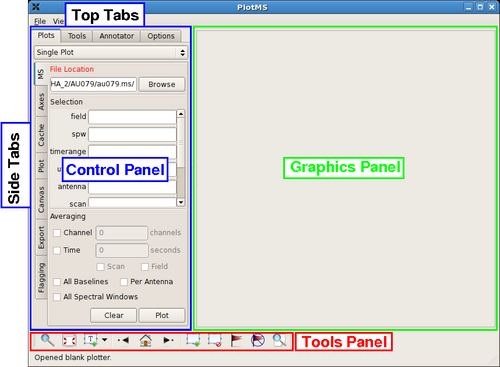
This command brings up the PlotMS window, shown with annotations at right. The window comprises three panels: the control panel (outlined in blue), the graphics panel (green), and the tools panel (red). The control panel controls the selection of data for display and the graphing parameters (axis selection, axis limits, and so on). The graphics panel is the display panel for two-dimensional (x, y) projections of the data. The tools panel provides commands to interact with the graphics panel. The control panel further breaks down into a series of tabs, annotated as Top Tabs and Side Tabs, which contain related plotting and editing control parameters. This tutorial employs only the Plots tab among the Top Tabs and the following Side Tabs.
In this tutorial, interactive commands in the PlotMS window will be summarized as (Tab)Command,, where (Tab) represents the Side Tab where the command is found, and Command is the appropriate GUI interaction (button press, text field, checkbox, etc.). Use the (MS)Browse button, or enter the full pathname, to navigate to and select the measurement set (here, au079.ms).
|
Identifying Bad Data by Discrepant Amplitudes
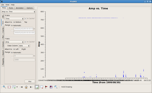
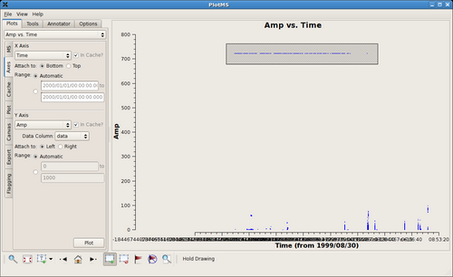
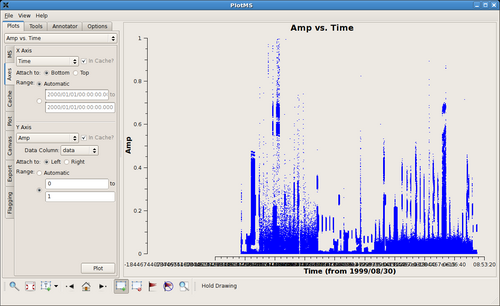
Tip: The automatic scaling of the data axes are cached and so are unaffected by flagging. To rescale (semi-) automatically, change the
(Axes)X Axis to some other arbitrary projection (say, Scan), (Axes)Plot, and then reset (Axes)X Axis to its original state
(say, Time).
|
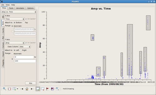
After zapping those obviously high visibilities, things become a little more challenging. The figure at right shows a close up of the remaining visibilities between 0 and 1 Jy flux density. There probably remain bad data there, but it's hard to tell on the crowded plot. At this point it's better to examine individual sources within this multisource measurement set. |
Examining Individual Sources within a Measurement Set
|
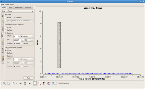
Use the following settings to look specifically at the first source of the measurement set.
Notice that the Plot button is available from more than one tab. The figure at right shows the result. The bad data have been highlighted using the Mark Regions tool. |
|
The figure at right shows the remaining data for the first source (field = 0) after flagging the obviously discrepant points. Things look deceptively OK, but in fact there remains bad data from one antenna. The antenna contributed poor data for the entirety of the observation of this source, and, since the problem is not isolated in time, it is difficult to see the problem. |
|
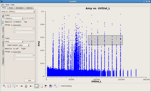
Here are the same data reprojected onto baseline separations, (Axes)X Axis = UVDist_L (projected baseline separations in units of the observing wavelength). The misbehaving antenna shows up as spikes in these snapshot observations, because each antenna pair with that antenna corresponds to only a narrow range of baseline separations. (A longer observation would produce broader spikes, because the projected baseline separations would vary with the rotation of the earth under the source.) The idea now would be to highlight a subset of the discrepant data as shown in the figure and extend the flags to the common antenna of these baselines. |
Antenna-Based Flagging
--Jack Gallimore 14:38, 1 December 2009 (UTC)
