Inspecting Data
Overview
Now that you've obtained your measurement set (MS), you will probably want to look at it carefully to see what it contains. This CASA Guide will describe a set of CASA tasks designed to help you evaluate and understand the data in an MS.
Following the example in Loading Data, we will be using the MS TVER0002.sb2568947.eb2579996.55518.22356400463.ms in this Guide. Please see Loading Data for instructions on acquiring this dataset, or use your own MS for practice.
Initial inspection: listobs
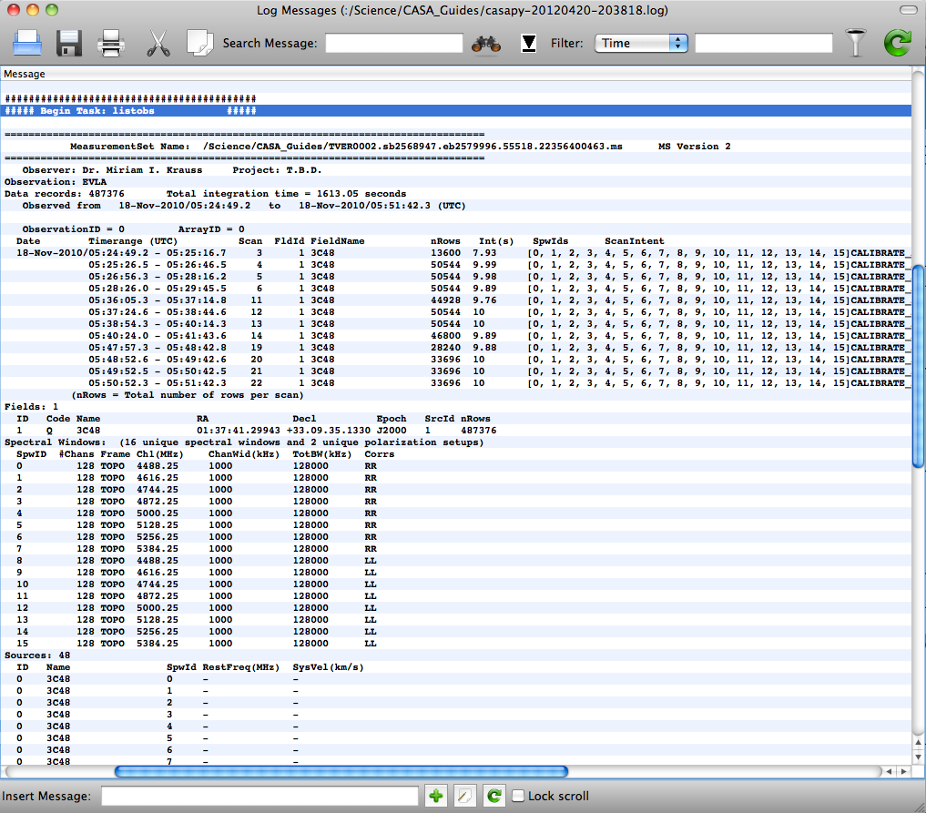
The best way to get a quick overview of the data in an MS is by using listobs:
# In CASA
listobs(vis='TVER0002.sb2568947.eb2579996.55518.22356400463.ms')
This sends useful information about the MS to the logger window, as well as to the current log file in the directory in which you started CASA.
Looking at this, we can see that our MS contains only a single object, 3C48, and a total of 12 scans of ~1.5-minute duration each with 10s integrations. There are 15 spectral windows, the first half containing RR and second half with LL polarizations. The "nRows" column tells us the number of rows for a particular scan in the MS. Each MS row has a unique timestamp, baseline, and SPW; for example, Scan 3 has 50544 / 16 (SPWs) / 351 (baselines) = 9 integrations, which makes sense for 10-s integrations and a 90-s scan length.
In order to get much of this information into a Python array, it is helpful to use the listsdm task. In order to get this to work, you will need the original SDM tables, which can be downloaded from the archive with your data (check "Include verbatim SDM tables in MS") or stand-alone ("SDM tables only (no visibiliites)" gets just the tables; ignore the file size, this will only be a few hundred MB). Then, you can type:
# In CASA
scanList = listsdm(vis='TVER0002.sb2568947.eb2579996.55518.22356400463.ms')
listsdm will output information both to the logger window and to a Python dictionary which we've called "scanList" -- this can be useful, for example, if you're scripting your processing, or if you have a large dataset (in which case listobs can be slow to execute).
Checking the online flags
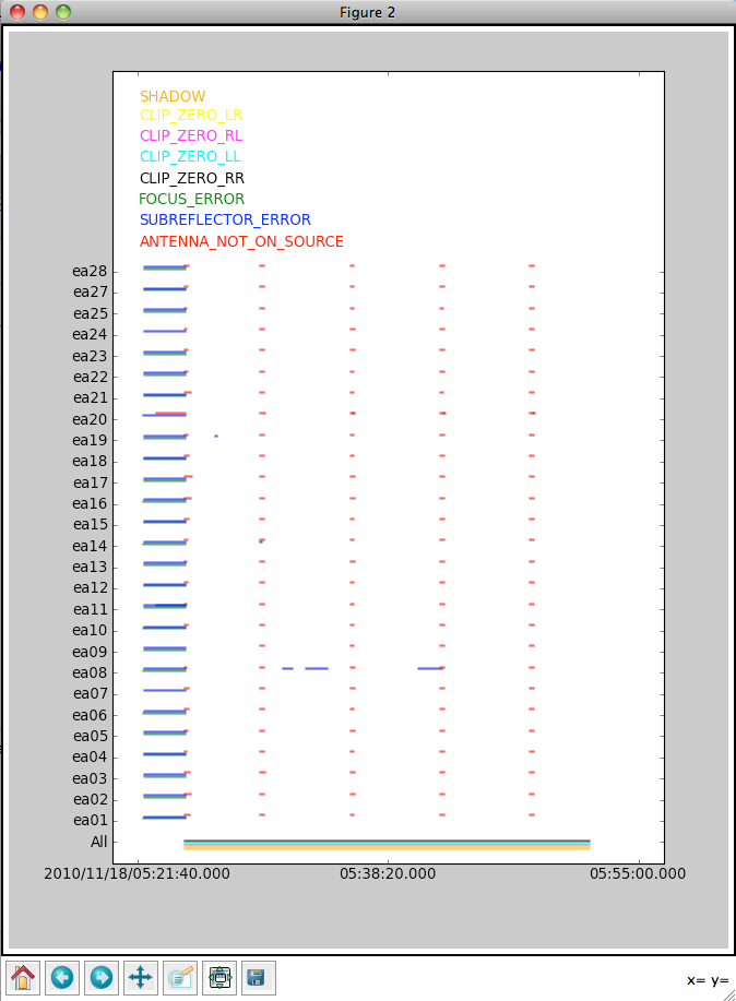
It's useful to start by checking which data have already been deleted (flagged) by the "online" flags (including time periods when the antennas were pointing off-source, or there were focus or subreflector errors), as well as data that were flagged because they were shadowed (blocked by a nearby antenna) or zero-valued (indicating a correlator error).
To do this, use the flagcmd task to produce a plot:
# In CASA
flagcmd(vis='TVER0002.sb2568947.eb2579996.55518.22356400463.ms',action='plot')
From this, we can see that antenna ea08 had some subreflector issues, and lengths of time when an antenna was not "on source" (i.e., it was slewing from one object to the next) varied a bit according to antenna. This accounts for the fact that the integration times provided by listobs are not exactly 10 s: the first integration of a given scan begins when the first antenna arrives on-source; since this does not happen simultaneously for all antennas, and the given integration time is an average across antennas, we can get values like 7.93 s (as for Scan 3).
Although the shadow and clip flags are plotted as well, the exact times affected by these flags are not known, so do not be alarmed by the fact that they appear to span the entire plot -- this is rarely actually the case.
Unfortunately, since we requested time-averaged data from the archive, the flagged data are not included in the MS. If you are concerned about the possible erroneous deletion of good data, it's best to download the complete MS, inspect it with plotms (see below), and then perform time and / or frequency averaging.
Checking the weather information
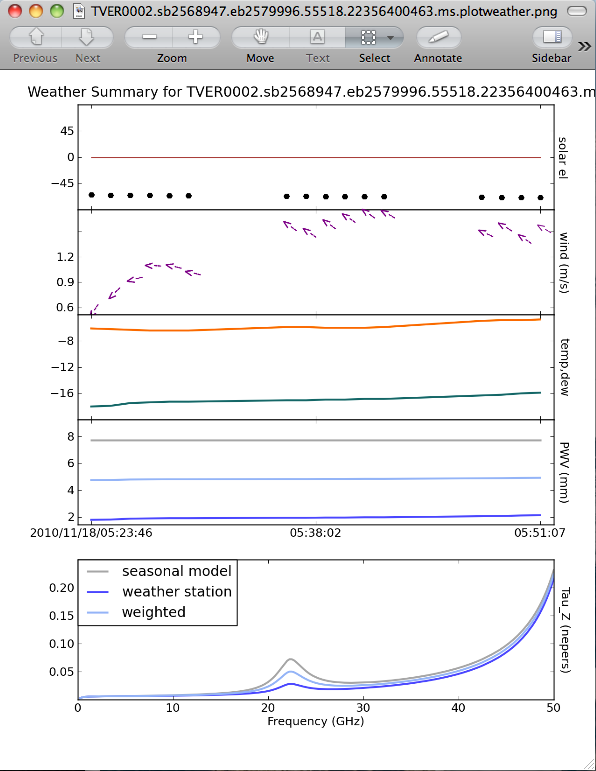
Another good thing to check is what the weather conditions were like during the observation. The task that does this is plotweather:
# In CASA
opacities = plotweather(vis='TVER0002.sb2568947.eb2579996.55518.22356400463.ms')
The plot is automatically named vis + ".plotweather.png," so in this case, TVER0002.sb2568947.eb2579996.55518.22356400463.ms.plotweather.png. Use your favorite graphics tool to open the file and inspect the information.
The top panel shows the solar elevation -- in this case, the observation was done at night (the black disk represents the sun, below the red line, which is the horizon). The second panel shows the wind speed and direction -- here, the wind was pretty calm (between 0.6 and 1.7 m/s). The temperature and dewpoint are shown in the next panel. This observation was performed in mid-November, and it was quite cold!
The last two panels plot the precipitable water vapor (PWV) and opacity (Tau_z) for three quantities: the value determined from the "seasonal model," the JVLA weather station, and a weighted average. See EVLA Memo 143 for more details.
In addition, you may notice that we set a variable opacities to capture output from plotweather. This task outputs a list of opacities, one for each spectral window, to use for calibration.
Graphical display: plotms
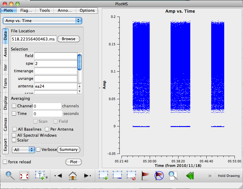
Now that we have some information about what data are in the MS, it's good to have a look at the data in graphical representation. One CASA task with which this can be done is plotms. Since JVLA datasets are generally quite large, it's good to call plotms with only a carefully-chosen subset of data, rather than the full MS, since this could take a long time to load (or not load at all, if it exceeds the memory limits of your machine).
Let's start by plotting a single spectral window and antenna. Since there's only one source in the MS, we won't limit by field, but this is a good thing to consider as well.
# In CASA
plotms(vis='TVER0002.sb2568947.eb2579996.55518.22356400463.ms', spw='2', antenna='ea24')
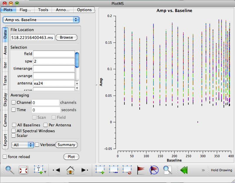
Note that by default, plotms displays amplitude vs. time; one could request other axes via the command line if desired, or change these values in the GUI. For example, we can see that there are some low-amplitude points -- it's not clear from this initial plot what their origin is. Go to the "Axes" tab, and change the X axis to Baseline. Also, go to the "Display" tab, check the "Colorize by" box, and select "Channel."
From this second plot, we can see that the low amplitudes appear to be due to a single antenna. Click in the "Mark Regions" tool at the bottom of the gui (the open box with a green "plus" sign), and use the mouse to select these low-amplitude points. Click on the "Locate" button (magnifying glass), and information associated with the selected points will be displayed in the logger window. We can see that they are all the baseline ea13-ea24 (remember that we selected only ea24 for plotting), so ea13 is suspicious.
Since there doesn't seem to be any correlation with channel, we can test this some more by going back to the "Data" tab, changing the SPW selection to "0:28~32" to get a subset of channels, and deleting "ea24" so that the antenna selection field is blank. Hit "Plot" again, and now it is clear that antenna ea13 was bad across all its baselines -- this antenna should be flagged before proceeding with processing.
Another way of limiting the amount of plotted data is to request averaging across a selected axis, often time or frequency (though other options include across baselines and per antenna). Note that if you choose time, you also have the option of averaging across scan and / or field; otherwise, the averaging will be done separately across scan or field boundaries.
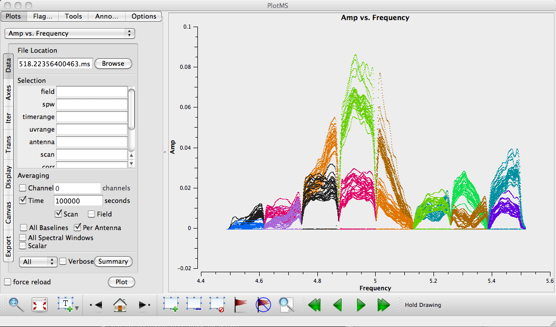
For example, with our data, we can look at a "raw" spectrum for each antenna by selecting Time + Scan and Per Antenna averaging, and entering a time range of 1e5 seconds (so that all data are sure to be included). You could do this in the GUI, or by issuing a command-line call to plotms:
# In CASA
plotms(vis='TVER0002.sb2568947.eb2579996.55518.22356400463.ms', avgtime='1e5', \
       avgscan=True, avgantenna=True, coloraxis='spw', xaxis='freq', yaxis='amp')
Note that antenna ea13 is still appearing as anomalously low-amplitude points. If you like, you can enter "!ea13" in the antenna selection box, and it will be excluded from plotting.
Although it's possible to flag data using plotms, this is not recommended, since it is quite easy to miss data (if you're only plotting a subset) or flag data by mistake, in which case it can be difficult to recover. Better yet, use tflagdata or flagcmd to flag your data, and keep a careful log of what's been flagged and why.
Graphical display: msview and the CASA viewer
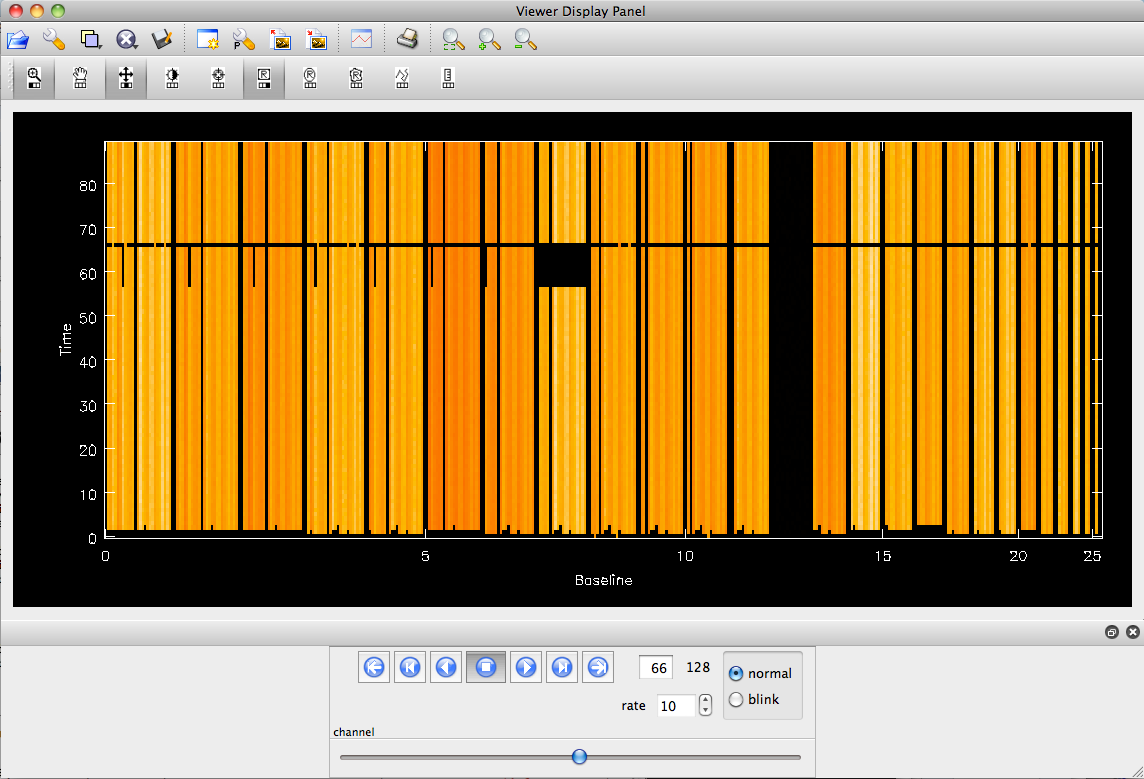
The CASA viewer can be used to display the MS as a raster image, showing the amplitude as a function of time and baseline. First, start the viewer without any options; this will allow us to make data selections prior to loading the data:
# In CASA
msview
A "Load Data" dialog box will appear with a directory listing. Choose TVER0002.sb2568947.eb2579996.55518.22356400463.ms, then enter "2" in the spectral window box. Finally, click "raster image" to display the data. By default, it starts with the central channel of this SPW -- you can use the tape deck at the bottom to step forward or back in the data. Note that there could be a bit of RFI in channel 120; otherwise, this SPW looks very clean.
Also note that antenna ea13 looks like it's missing data. This isn't actually the case; it's just an artifact of the default scaling. To change this, click on the wrench icon at the top left and modify the "scaling power cycles" and "data maximum" to reveal the data from ea13.