Averaging data in plotms: Difference between revisions
No edit summary |
No edit summary |
||
| Line 7: | Line 7: | ||
<div style="float: left; width: 50%; align: left;"> | <div style="float: left; width: 50%; align: left;"> | ||
However, time averaging can be a little confusing, as it is controlled by three fields. If you click the checkbox next to '''Time''' under '''Averaging''', a blank box with units of 'seconds' should become active, along with two checkboxes: '''Scan''' and '''Field'''. To the right, we've plotted two calibrator sources from a multi-source measurement set. There has been no averaging. One is a phase calibrator observed in six scans, while the other is a brighter flux calibrator observed in one scan at the end of the observations. | |||
</div> | </div> | ||
<div style="float: right; width: 50%; text-align: center;"> | <div style="float: right; width: 50%; text-align: center;"> | ||
[[File: | [[File:plotms_timeave0.jpg | 400px]] | ||
''Click to enlarge'' | ''Click to enlarge'' | ||
Revision as of 21:22, 18 February 2010
You can average your measurement set on the fly with plotms. The averaging options can be found under the Data tab, and are mostly intuitive.
|
However, time averaging can be a little confusing, as it is controlled by three fields. If you click the checkbox next to Time under Averaging, a blank box with units of 'seconds' should become active, along with two checkboxes: Scan and Field. To the right, we've plotted two calibrator sources from a multi-source measurement set. There has been no averaging. One is a phase calibrator observed in six scans, while the other is a brighter flux calibrator observed in one scan at the end of the observations. |
|
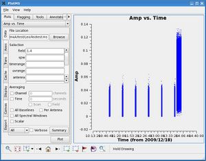
However, time averaging can be a little confusing, as it is controlled by three fields. If you click the checkbox next to Time under Averaging, a blank box with units of 'seconds' should become active, along with two checkboxes: Scan and Field. To the right, we've plotted two calibrator sources from a multi-source measurement set. There has been no averaging. One is a phase calibrator observed in six scans, while the other is a brighter flux calibrator observed in one scan at the end of the observations.
|

