Data flagging with plotms
Disclaimer: Due to continuous CASA software updates, GUI images may look different on more recent versions than those shown here.
Plotms is a tool to inspect and edit measurement sets. This tutorial demonstrates how to use plotms to edit a multisource continuum data set: VLA program AU079, which consists of L-band (20 cm) continuum observations of galaxies and calibrator sources. It is the same data set used in the Data flagging with viewer tutorial.
Loading the Measurement Set into Plotms
The data for this tutorial may be loaded into CASA using the importvla command. The following commands import the data into the measurement set au079.ms and exit CASA to the command line.
# import the glob command for filename searching with wildcards
from glob import glob

# Define the list of files for reading. Use glob to perform wildcard matching with VLA archive filenames.
fileList = glob('AU079_*.xp?')

importvla(archivefiles=fileList,vis='au079.ms')
exit()
Now start up plotms from within CASA.
# in CASA
plotms()
|
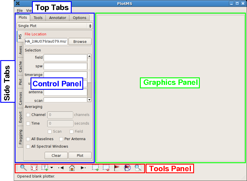
This command brings up the PlotMS window, shown with annotations at right. The window comprises three panels: the control panel (outlined in blue), the graphics panel (green), and the tools panel (red). The control panel controls the selection of data for display and the graphing parameters (axis selection, axis limits, and so on). The graphics panel is the display panel for two-dimensional (x, y) projections of the data. The tools panel provides commands to interact with the graphics panel. The control panel further breaks down into a series of tabs, annotated as Top Tabs and Side Tabs, which contain related plotting and editing control parameters. This tutorial employs only the Plots tab among the Top Tabs and the following Side Tabs.
In this tutorial, interactive commands in the PlotMS window will be summarized as (Tab)Command,, where (Tab) represents the Side Tab where the command is found, and Command is the appropriate GUI interaction (button press, text field, checkbox, etc.). Use the (Data)Browse button, or enter the full pathname, to navigate to and select the measurement set (here, au079.ms).
|
Beta Alert: At the time of this writing, plotms was undergoing rapid development. The specific locations of tabs, whether side tabs or top tabs, for example, will likely change prior to release. Watch this space!
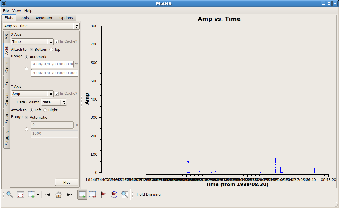
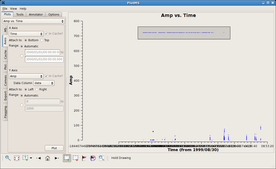
Identifying Bad Data by Discrepant Amplitudes
Tip: The automatic scaling of the data axes are cached and so are unaffected by flagging. To rescale (semi-) automatically, change the
(Axes)X Axis to some other arbitrary projection (say, Scan), (Axes)Plot, and then reset (Axes)X Axis to its original state
(say, Time).
|
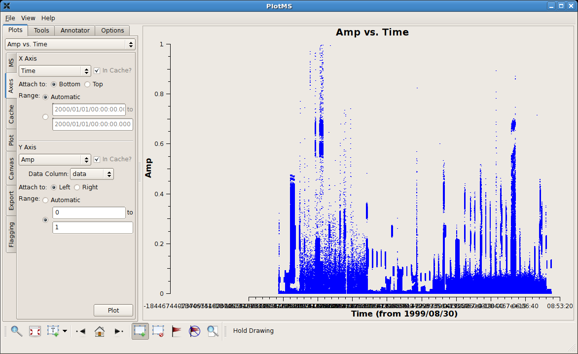
After zapping those obviously high visibilities, things become a little more challenging. The figure at right shows a close up of the remaining visibilities between 0 and 1 Jy flux density. There probably remain bad data there, but it's hard to tell on the crowded plot. At this point it's better to examine individual sources within this multisource measurement set. |
Examining Individual Sources within a Measurement Set
In this part of the tutorial we'll look at the first two sources of the multisource measurement set (field = 0 and field = 1). The techniques are easily generalized to the remaining sources by incrementing the field identifier (field = 2, 3, 4, ...).
|
Use the following settings to look specifically at the first source of the measurement set.
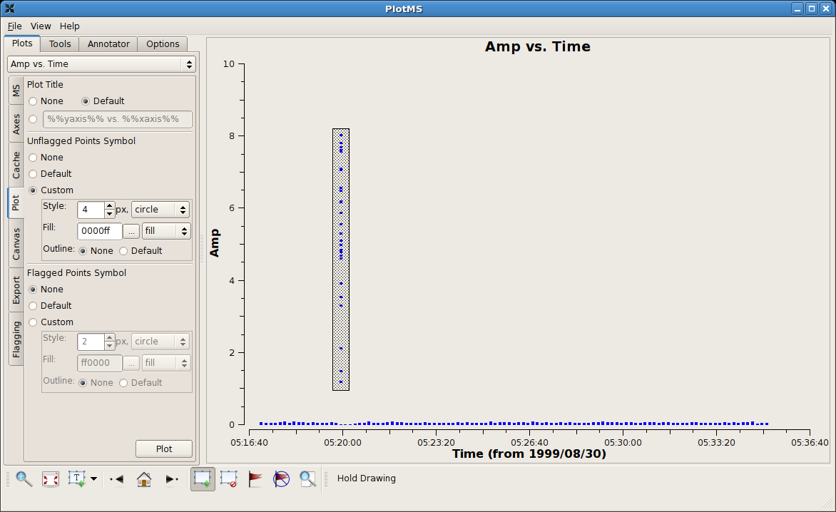
Notice that the Plot button is available from more than one tab. The figure at right shows the result. The bad data have been highlighted using the Mark Regions tool. |
|
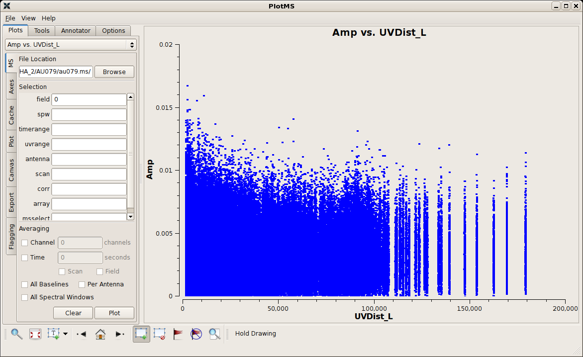
The figure at right shows the unflagged data for the first source (field = 0) after flagging the obviously discrepant points. Things look deceptively OK, but in fact there remain bad data from one antenna. The antenna contributed poor data for the entire observation of this source, and, since the problem is not isolated in time, it is difficult to see it in this projection. |
|
Here are the same data reprojected onto baseline separations, (Axes)X Axis = UVDist_L (projected baseline separations in units of the observing wavelength). The misbehaving antenna shows up as spikes in these snapshot observations, because each baseline with that antenna spans only a narrow range of baseline separations. (A longer observation would produce broader spikes, because the projected baseline separations would span a greater range as they rotate with the earth under the source.) The idea now would be to highlight a subset of the discrepant data as shown in the figure and extend the flags to the common antenna of these baselines. At the time of this writing, this option is not available in the development build of plotms, but keep an eye on (Flagging)Extend flags = Antenna.
|
Antenna-Based Flagging
Clearly we have a bad antenna on this field, and the question remains how to deal with it within plotms. One option we have is to plot baselines to one antenna at a time, using (Data)antenna, until the bad data show up. This approach is not very practical, however, considering that a given measurement set may have dozens of telescopes to search through and perhaps as many sources.
Instead, use the Locate ![]() tool to list the properties of the data within the highlighted region. Here's a subset of the listing that results and is reported to the terminal running plotms.
tool to list the properties of the data within the highlighted region. Here's a subset of the listing that results and is reported to the terminal running plotms.
PlotMS::locate+ Scan=1 Field=0 Time=1999/08/30/05:25:55.0 BL=0-10 Spw=0 Chan=0 Freq=1.4649 Corr=6 X=131224 Y=0.0534296 (27877/21/577)
PlotMS::locate+ Scan=1 Field=0 Time=1999/08/30/05:26:05.0 BL=10-19 Spw=0 Chan=0 Freq=1.4649 Corr=8 X=90195.5 Y=0.05591 (28759/22/159)
PlotMS::locate+ Scan=1 Field=0 Time=1999/08/30/05:26:05.0 BL=0-10 Spw=0 Chan=0 Freq=1.4649 Corr=8 X=131224 Y=0.0503287 (29179/22/579)
PlotMS::locate+ Scan=1 Field=0 Time=1999/08/30/05:26:15.0 BL=0-10 Spw=0 Chan=0 Freq=1.4649 Corr=6 X=131223 Y=0.0568316 (30477/23/577)
PlotMS::locate+ Scan=1 Field=0 Time=1999/08/30/05:26:15.0 BL=0-10 Spw=0 Chan=0 Freq=1.4649 Corr=8 X=131223 Y=0.0611954 (30479/23/579)
PlotMS::locate+ Scan=1 Field=0 Time=1999/08/30/05:26:35.0 BL=10-19 Spw=0 Chan=0 Freq=1.4649 Corr=8 X=90205.1 Y=0.052479 (32659/25/159)
PlotMS::locate+ Scan=1 Field=0 Time=1999/08/30/05:26:35.0 BL=10-11 Spw=0 Chan=0 Freq=1.4649 Corr=8 X=147929 Y=0.0619749 (33151/25/651)
PlotMS::locate+ Scan=1 Field=0 Time=1999/08/30/05:26:35.0 BL=8-10 Spw=0 Chan=0 Freq=1.4649 Corr=8 X=115989 Y=0.0547681 (33219/25/719)
PlotMS::locate+ Scan=1 Field=0 Time=1999/08/30/05:26:45.0 BL=10-19 Spw=0 Chan=0 Freq=1.4649 Corr=7 X=90208.3 Y=0.0577008 (33958/26/158)
PlotMS::locate+ Scan=1 Field=0 Time=1999/08/30/05:26:45.0 BL=0-10 Spw=0 Chan=0 Freq=1.4649 Corr=6 X=131221 Y=0.0504603 (34377/26/577)
PlotMS::locate+ Scan=1 Field=0 Time=1999/08/30/05:26:55.0 BL=0-10 Spw=0 Chan=0 Freq=1.4649 Corr=8 X=131220 Y=0.0518869 (35679/27/579)
The antenna pairs are listed as BL= (baseline = ). The common, or culprit, antenna for the highlighted data is #10. Plot just the data to that antenna by selecting (Data)antenna = 10.
Cross-Pol Data of Bright Sources
|
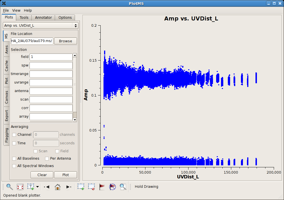
(Data)field = 1 is shown at right. This is a bright calibrator source. The data values near 0 Jy are cross-pol data rather than discrepant data; these cross-pol data won't be as obvious in the plots for fainter sources. Tip: To plot only a subset of the correlations, set the corr parameter in the Data tab. Typing RR,LL in this window should exclude the cross-pol data.
We see some of the familiar spiking that we saw in field = 0. Use again the locate tool on the highlighted selection. Here's a trimmed snippet of the output. Time=1999/08/30/05:16:35.0 BL=5-10 Time=1999/08/30/05:16:35.0 BL=10-13 Time=1999/08/30/05:16:35.0 BL=2-10 Time=1999/08/30/05:16:45.0 BL=10-18 Time=1999/08/30/05:16:45.0 BL=6-10 Time=1999/08/30/05:16:45.0 BL=3-10 Time=1999/08/30/05:16:45.0 BL=10-16 Time=1999/08/30/05:16:45.0 BL=10-24 Notice that antenna #10 reappears as a culprit. |
Manual Flagging
On the strength of inspection of two sources, antenna #10 appears to be producing consistently wonky data. At this point, it's worth getting out of plotms and returning to CASA to perform manual editing using flagdata. We'll throw caution to the wind and assume that antenna #10 was acting up during the entire observation.
# in casapy
default("flagdata")
vis = "au079.ms"
antenna = "10"
flagdata()
|
Now, load the data back into plotms, and set things up to plot (Data)field = 1 again; see figure at right. The data look much cleaner, with a few wonky points that can be easily cleaned up with interactive flagging. Displaying a Subset of Spectral Windows and ChannelsBy default, plotms will plot all spectral windows and all channels. To select only a subset of spectral windows and/or channels, use the (Data)spw field. The normal CASA syntax (described here) should work in most cases. One notable exception is if you would like to display only one channel; in this case, in plotms, you still need to write it as a range. For example, to plot channel 30 of spectral window 0, type 0:30~30 in the (Data)spw field. Displaying and Flagging Calibrated DataOnce you have applied a calibration to your data with applycal, take note of the drop down menus called (Axes)Data Column. If you choose 'data', plotms will plot the raw uncalibrated data. To plot the calibrated version of the data, select 'corrrected'. If plotms is open and running in the background, and you apply an updated calibration to your data, just refresh the plot of the 'corrected' data, and you should see the newest calibration. ↵ Averaging Data in Plotms Last checked on CASA Version 4.7.2 --Jack Gallimore 14:38, 1 December 2009 (UTC) |
