Plotbandpass: Difference between revisions
| Line 122: | Line 122: | ||
[[File:Bpoly overlay.DV09.spw0.t1.png|700px]] | [[File:Bpoly overlay.DV09.spw0.t1.png|700px]] | ||
== Overlay a bandpass solution with a smoothed version created by smoothbandpass == | == Overlay a bandpass solution with a smoothed version created by [[smoothbandpass]] == | ||
<source lang="Python"> | |||
# In CASA | |||
au.plotbandpass(caltable='bandpass.bcal',caltable2='bandpass.bcal_smooth',xaxis='freq', | |||
yaxis='both',overlay='',figfile='smooth',antenna='DV07') | |||
</source> | |||
The "c1" and "c2" labels in the legend correspond to caltable and caltable2: | |||
[[File:Smooth.DV07.spw0.t1.png|700px]] | |||
== Display a Tsys solution for individual times for one field == | == Display a Tsys solution for individual times for one field == | ||
Revision as of 15:52, 4 January 2012
Return to Analysis Utilities
This page documents the plotbandpass function of Python module analysisUtils.
The plotbandpass function provides extended capabilities beyond those of CASA's plotcal. It was written to facilitate rapid visualization of ALMA's bandpass and spectral Tsys measurements in Science Verification and Early Science data, but it can be used on EVLA data as well. It is distributed with the analysisUtils Python module which provides numerous other Python extensions callable from within CASA. Analysis Utilities has been tested on dual-polarization ALMA data, and single-, dual-, and full-polarization EVLA data. The function parameters can always be obtained by giving parameter: help=True. For example,
# In CASA
import analysisUtils as au
au.plotbandpass(help=True)
$Id: plotbandpass.py,v 1.118 2011/12/13 20:12:47 thunter Exp $
Usage: plotbandpass(caltable='', antenna='', field='', spw='', yaxis='amp',
   xaxis='chan', figfile='', plotrange=[0,0,0,0], help=False, caltable2='',
   overlay='', showflagged=False, timeranges='', buildpdf=False, caltable3='',
   markersize=3, density=108, interactive=True, showpoints='auto',
   showlines='auto', subplot='22', zoom='', poln='', showatm=False, pwv='1.0',
   gs='gs', convert='convert', chanrange='', debug=False, vm='',
   solutionTimeThresholdSeconds=60.0, phase='')
 antenna: must be ID (int or string or list), or a single antenna name or list
 atm: overlay the atmospheric transmission curve for the weather and elevation
 buildpdf: True/False, if True and figfile is set, assemble pngs into a pdf
 caltable: a bandpass table, of type B or BPOLY
 caltable2: a second cal table, of type BPOLY or B, to overlay on a B table
 caltable3: a third cal table, of type BPOLY, to overlay on the first two
 chanrange: set xrange (e.g. '5~100') over which to autoscale y-axis for xaxis='freq'
 convert: full path for convert command (in case it's not found)
 density: dpi to use in creating PNGs and PDFs (default=108)
 field: must be an ID, source name, or list thereof; can use trailing *: 'J*'
 figfile: the base_name of the png files to save: base_name.antX.spwY.png
 gs: full path for ghostscript command (in case it's not found)
 help: print this message
 interactive: if False, then figfile will run to completion automatically
 overlay: 'antenna' or 'time', make 1 plot with different items in colors
 showflagged:  show the values of data, even if flagged
 markersize: size of points (default=3)
 phase: the y-axis limits to use for phase plots when yaxis='both'
 plotrange: define axis limits: [x0,x1,y0,y1] where 0,0 means auto
 poln: polarizations to plot (e.g. 'XX','YY','RR','LL' or '' for both)
 pwv: define the pwv to use for the showatm option: 'auto' or value in mm
 showatm: compute and overlay the atmospheric transmission curve
 showlines: draw lines connecting the data (default=T for amp, F for phase)
 showpoints: draw points for the data (default=F for amp, T for phase)
 solutionTimeThresholdSeconds: consider 2 solutions simultaneous if within this interval (default=60)
 spw: must be single ID or list or range (e.g. 0~4, not the original ID)
 subplot: 11,22,32 or 42 for rows x columns; options: 11,22,32 or 42 (default=22)
 timeranges: show only these timeranges, the first timerange being 1
 vm: a result from ValueMapping, returned from a previous call
 xaxis: 'chan' or 'freq'
 yaxis: 'amp', 'phase', or 'both' == 'ap'; append 'db' for dB
 zoom: 'intersect' will zoom to overlap region of caltable with caltable2
If help is not True, the return value is the ValueMapping structure for the specified MS.
Regarding the showatm=True parameter, since most people reducing ALMA data do not load the ASDM_CALWVR table into the MS, the atmospheric transmission curve will be computed by default for 1.0 mm, but you can set the PWV to any value using the pwv option. If you want the fully correct curve for ALMA, then copy the CalWVR.xml file from your ASDM to the present working directory and specify pwv='auto' .
Most of the regular CASA list syntax is accepted (commas and tildes) but negation via exclamation point is not supported, nor is channel selection within an spw. You are welcome to submit a ticket to the ALMA helpdesk if you want either of these capabilities. If you find any problems or unexpected behavior, please include the following information in your bug or enhancement request and send to helpdesk:
- the version number you are using, which is printed as the first line of output;
- the exact command; and
- a pointer to the dataset.
How to speed up the performance on large datasets
The plotbandpass function first needs to call ValueMapping to learn about the dataset and create a structure for future reference. If you plan to run the function many times on the same dataset, then you should store the return value of the structure from ValueMapping, like so:
# In CASA
vm = au.ValueMapping(your_ms)
Now, you can pass the result back to plotbandpass via the optional vm argument to avoid having to run ValueMapping inside of plotbandpass each time. It will do a sanity check to see if the MS name in the vm structure matches the MS name stored inside the caltable.
# All subsequent calls to plotbandpass will now run faster, as long as the vm=vm argument is passed.
au.plotbandpass(caltable='bandpass.bcal', vm=vm)
Display a simple bandpass solution
# In CASA
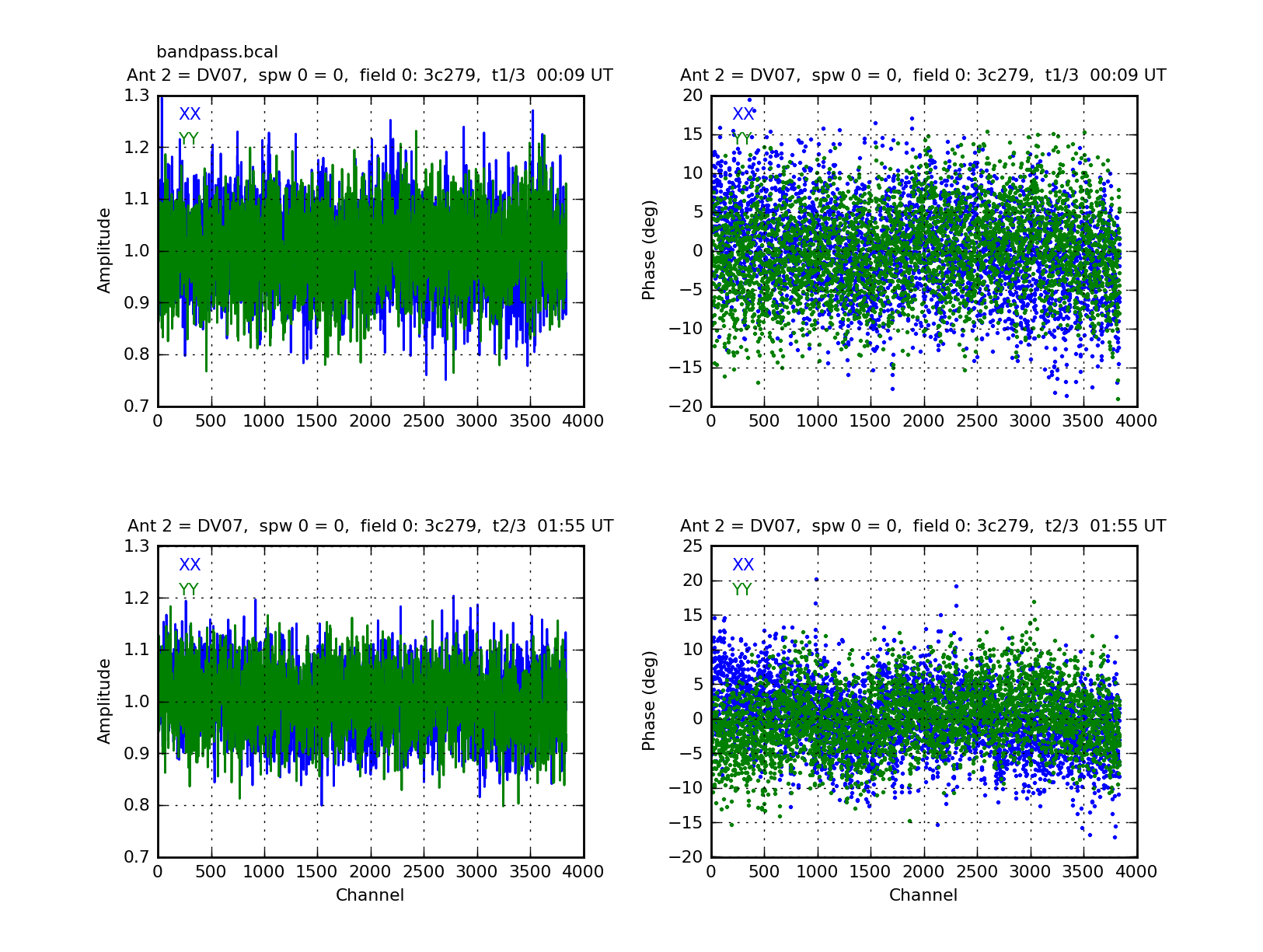
au.plotbandpass(caltable='bandpass.bcal',yaxis='both',antenna='DV07',figfile='bandpass')
Here we have specified a single antenna, but we could give a list, or leave it blank for all antennas. We have asked for both phase and amplitude which are shown in adjacent plots. Note how the ouput figfile name will be modified to include antenna number, spw, and timerange of the first panel for your convenience: bandpass.DV07.spw0.t1.png. The default style for amplitude is lines, and phase is points, but this can be changed with showpoints or showlines.
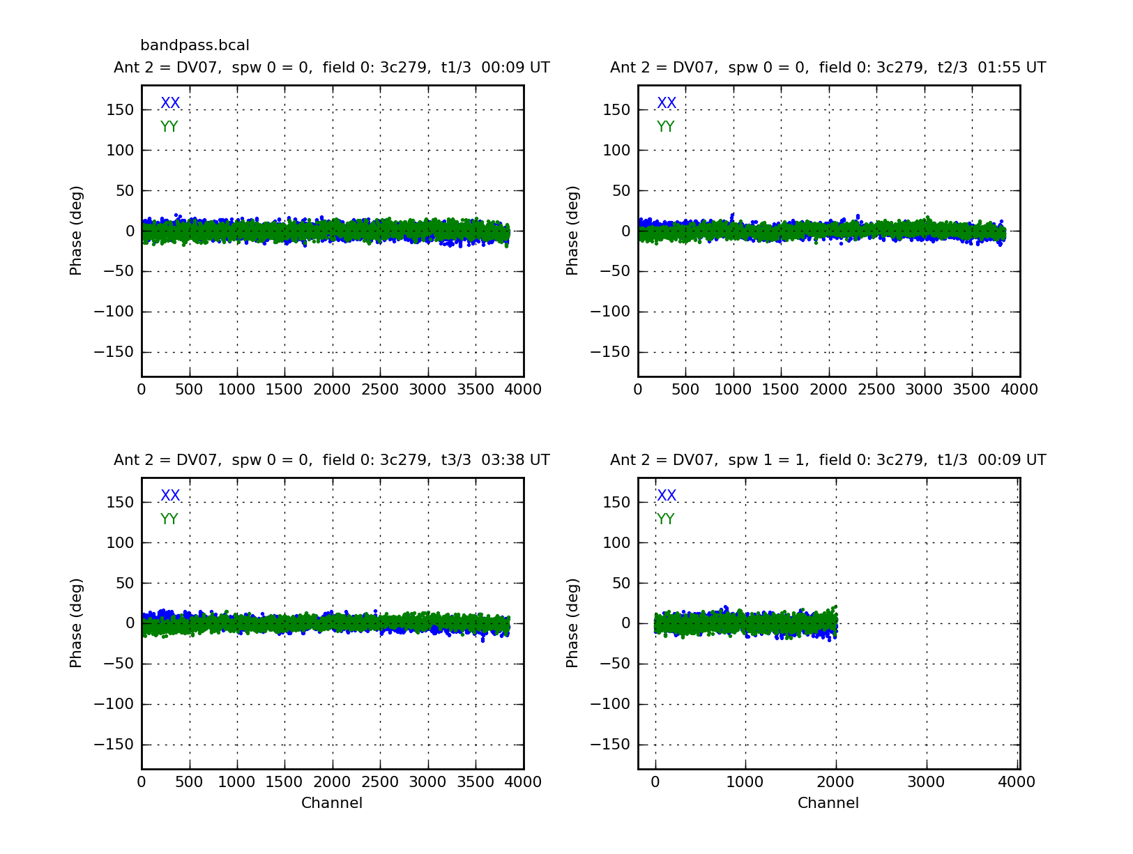
Maybe you prefer to see your phase plots on a common -180 to +180 degree scale. You can do that with plotrange and by limiting yourself to showing only the phase plots.
# In CASA
au.plotbandpass(caltable='bandpass.bcal',yaxis='phase',antenna='DV07',figfile='bandpass_phase',plotrange=[0,0,-180,180])
The first 3 plots are from the 3 different time ranges. The fourth plot is the first timerange on the second spw (spw=1). Notice how the upper half of the channels are missing. This is because they were flagged prior to the solution. The x-axis range reflects both flagged and unflagged data to visually remind you of this situation.
Display different (fixed) y-axis ranges for amplitude and phase
Alternatively, if you want to show both amplitude and phase plots on the same page, you can set a fixed amplitude range with the plotrange parameter, and a different fixed phase range with phase=[-180,180].
# In CASA
au.plotbandpass(caltable='bandpass.bcal',yaxis='both',antenna='DV07',figfile='bandpass_phase',plotrange=[0,0,0,5],phase=[-180,180])
Display a bandpass solution with a BPOLY solution overlaid
You can overlay a BPOLY solution on top of the regular B solution to see how well the polynomial reproduces the shape.
# In CASA
au.plotbandpass('bandpass_b_skipspw19high.bcal',overlay='',yaxis='phase',field='0',
                xaxis='freq',caltable2='bandpass_bpoly_skipspw19high.bcal',
                showpoints=True,spw=0,figfile='bpoly_overlay',antenna='4~7')
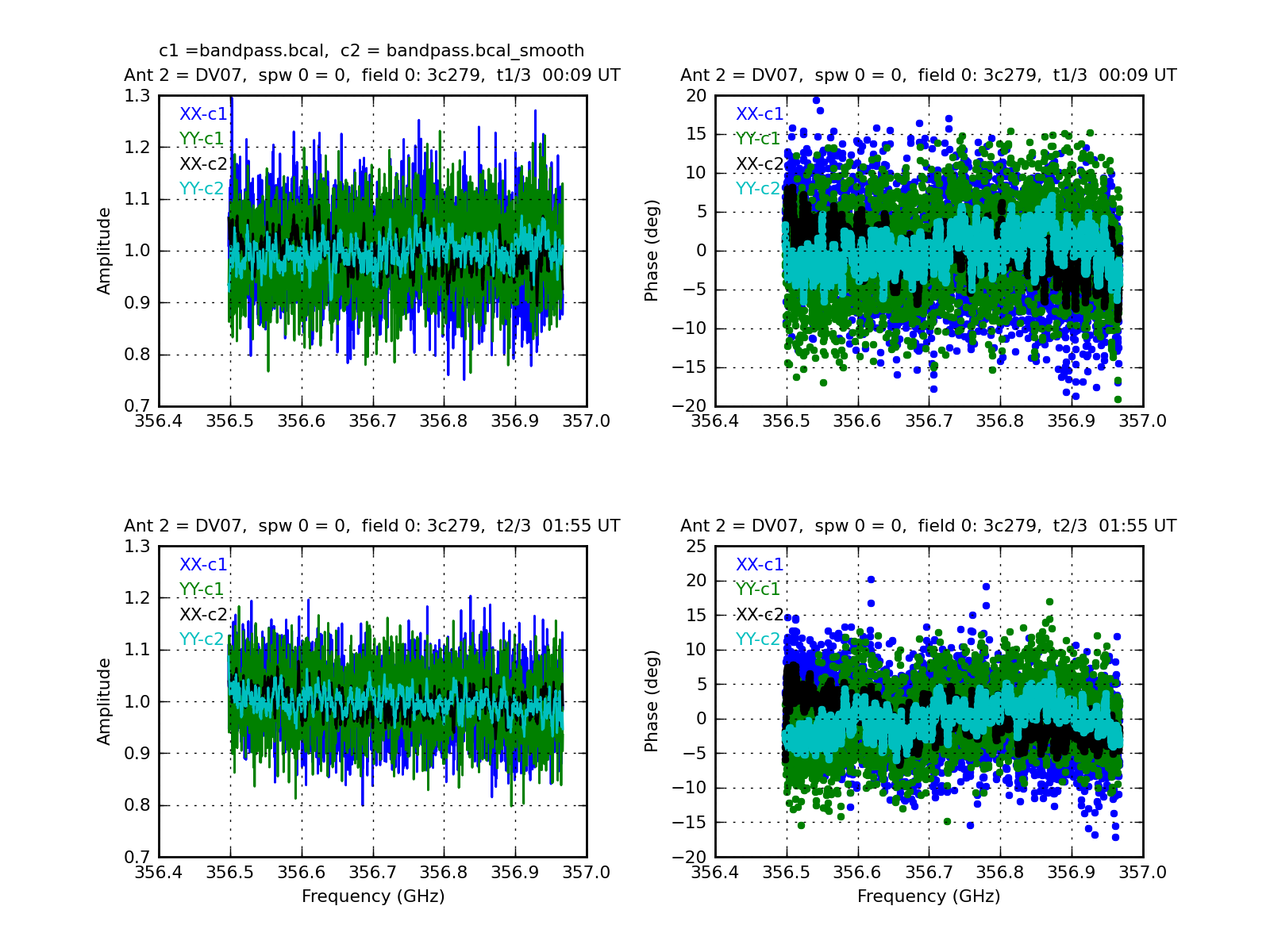
Overlay a bandpass solution with a smoothed version created by smoothbandpass
# In CASA
au.plotbandpass(caltable='bandpass.bcal',caltable2='bandpass.bcal_smooth',xaxis='freq',
                yaxis='both',overlay='',figfile='smooth',antenna='DV07')
The "c1" and "c2" labels in the legend correspond to caltable and caltable2:


