Spectral Viewer: Difference between revisions
Created page with "Category: CASA BasicsCategory: Interactive ToolsCategory: Analysis __FORCETOC__ '''A quick tutorial on how to use the Spectral Profile plotting tool, based on..." |
No edit summary |
||
| Line 5: | Line 5: | ||
'''A quick tutorial on how to use the Spectral Profile plotting tool, based on the CASA cookbook''' | '''A quick tutorial on how to use the Spectral Profile plotting tool, based on the CASA cookbook''' | ||
{|vspace="100" | {|vspace="100" | ||
|- | |||
| | |||
== Opening the Spectral Profile plotting tool == | |||
<div style="float: left; width: 50%; align: left;"> | |||
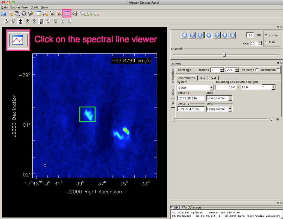
First, open the image viewer by calling 'viewer' from the CASA prompt, or 'casaviewer' from the command line. To select the region of your image for which you want to display the spectrum, use the Point, Rectangle, Ellipse or Polygon Region tool in the Viewer Display Panel (Figure 1). The values for extended regions are computed as the mean over all pixels within the marked region, (but you also have the option to view the median, sum, or flux). For Point positions, it is possible to mark multiple positions and switch between the positions by hovering over the respective markers (to remove a point or region box, hover over it and hit ESC). | |||
</div> | |||
<div style="float: right; width: 50%; text-align: center;"> | |||
[[File:viewer_tut1.png | 300px]] | |||
''Figure 1; Click to enlarge'' | |||
</div> | |||
|- style="background-color:#eeeeee;" | |||
| | |||
<div style="float: left; width: 50%; align: left;"> | |||
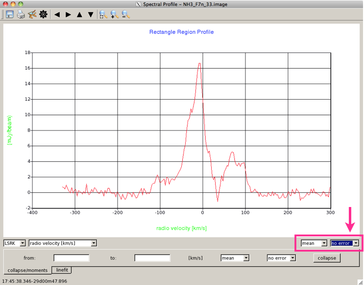
From the Main Toolbar of the Viewer (see Figure 2), the Spectral Profile plotting tool can be selected. This creates a new Spectral Profile window containing an x-y plot of the intensity versus spectral axis. The displayed spectrum is extracted in the region you have marked. | |||
</div> | |||
<div style="float: right; width: 50%; text-align: center;"> | |||
[[File:viewer_tut2.png | 300px]] | |||
''Figure 2; Click to enlarge'' | |||
</div> | |||
|- | |- | ||
| | | | ||
== Data Display Options == | |||
<div style="float: left; width: 50%; align: left;"> | |||
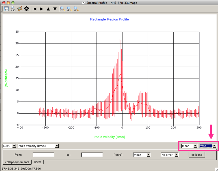
This is the Spectral Profile panel (Figure 3) that appears, showing the spectrum for the selected region in the image. If you have not yet selected a region, the spectral profile window will remain blank until you do. You can mark multiple regions for which you want to extract profiles; hovering over a region will display the corresponding spectrum in the Spectral Profile window. By default if you have selected a region larger than a point, the value plotted on the y-axis is the mean of data in the region. By default, the data are also plotted with no error bars. | |||
</div> | |||
<div style="float: right; width: 50%; text-align: center;"> | |||
[[File:viewer_tut3.png | 300px]] | |||
''Figure 3; Click to enlarge'' | |||
</div> | |||
|- style="background-color:#eeeeee;" | |||
| | |||
<div style="float: left; width: 50%; align: left;"> | |||
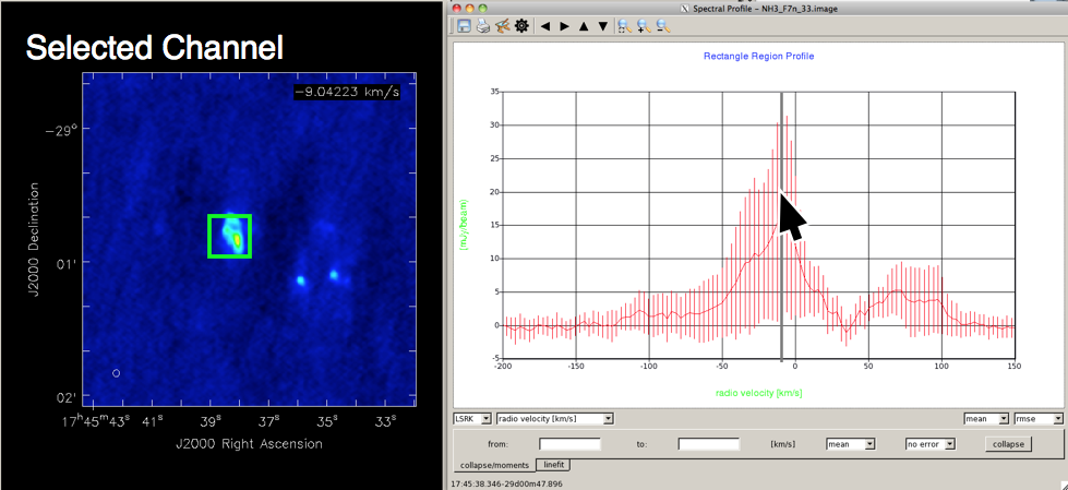
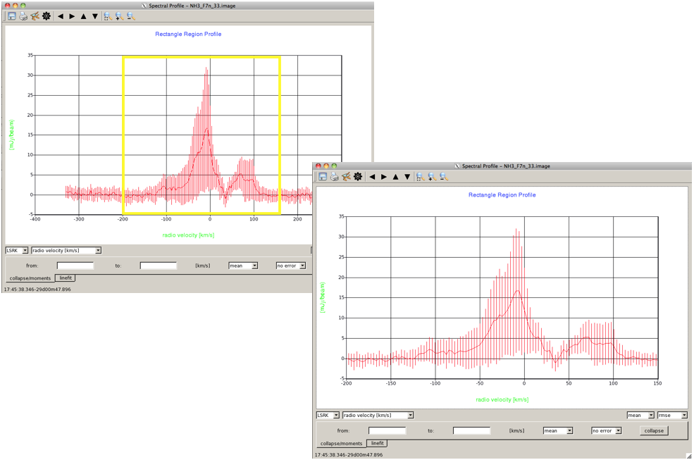
You can change both of these defaults in the two drop-down menus to the bottom right of the spectrum. Here (Figure 4), the data are shown plotted with the RMS error bars. Instead of displaying the mean on the y-axis, you can also view the median, sum, or flux of the data in the selected region. | |||
</div> | |||
<div style="float: right; width: 50%; text-align: center;"> | |||
[[File:viewer_tut4.png | 300px]] | |||
''Figure 4; Click to enlarge'' | |||
</div> | |||
|- style | |||
| | |||
== Selecting Data == | |||
<div style="float: left; width: 50%; align: left;"> | <div style="float: left; width: 50%; align: left;"> | ||
When you hover over the spectrum displayed in the Spectral Profile viewer, holding down the Ctrl-key will draw a grey vertical line at the position of the mouse. With the Ctrl-key held down, if you then click the left mouse button, the viewer will display the channel corresponding to that point in the spectrum (Figure 5). | |||
</div> | |||
<div style="float: right; width: 50%; text-align: center;"> | <div style="float: right; width: 50%; text-align: center;"> | ||
[[File: | [[File:viewer_tut7.png | 300px]] | ||
''Figure | ''Figure 5; Click to enlarge'' | ||
</div> | </div> | ||
| Line 28: | Line 83: | ||
| | | | ||
== | <div style="float: left; width: 50%; align: left;"> | ||
Using just the left mouse button, you can click on the spectrum to draw a box, and zoom in on a particular part of the spectrum (Figure 6). | |||
You can always unzoom to the original spectrum by, | |||
</div> | |||
<div style="float: right; width: 50%; text-align: center;"> | |||
[[File:vtut_5.png | 300px]] | |||
''Figure 6; Click to enlarge'' | |||
</div> | |||
|- | |||
| | |||
== Making a Moment Map == | |||
<div style="float: left; width: 50%; align: left;"> | <div style="float: left; width: 50%; align: left;"> | ||
The Spectral Profile tool allows you to quickly make several types of moment maps for the selected cube. | |||
With the mouse in the Spectral Profile window, clicking and dragging with the left mouse button, while holding down the Shift-key, will highlight a range of the spectrum (in grey). To remove the highlighted range, in the top toolbar, click the first magnifying glass on the left. The data can then be collapsed over the highlighted range. A drop-down menu below the spectrum allows you to choose between either summing the data, creating a Moment 0 map, or making an image of the mean or median values over the selected region of the spectral axis. Clicking 'collapse' will generate the requested image in the Viewer (Figure 7). | |||
Instead of selecting the data range by highlighting the spectrum, you can also enter the desired x-axis range directly in the 'from' and 'to' boxes below the spectrum. | |||
</div> | |||
<div style="float: right; width: 50%; text-align: center;"> | |||
[[File:viewer_tut6.png | 300px]] | |||
''Figure 7; Click to enlarge'' | |||
</div> | |||
|- style="background-color:#eeeeee;" | |||
| | |||
== Fitting Profiles == | |||
<div style="float: left; width: 50%; align: left;"> | |||
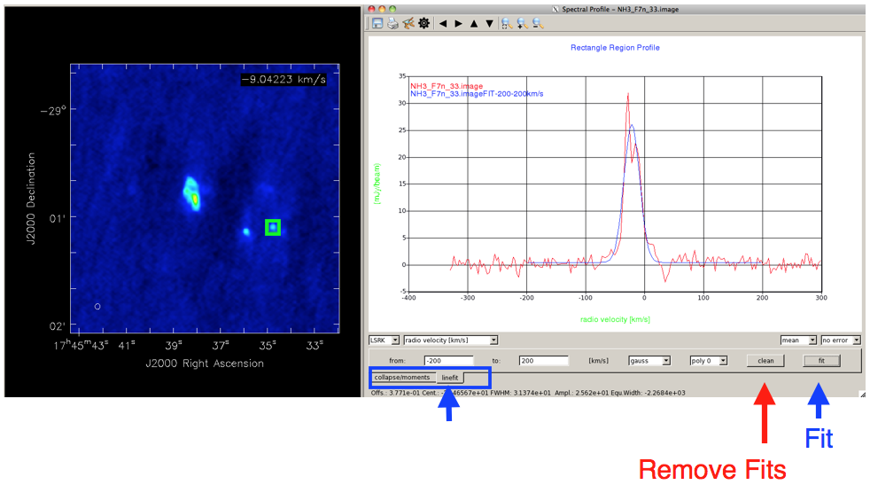
At the very bottom left of the Spectral Profile window is a tab which allows you to toggle between creating moment maps (the default), and fitting Gaussians. Clicking on the 'linefit' tab will allow you to fit a Gaussian + polynomial to the displayed spectrum. You can select the x-axis region to be fit with the 'from' and 'to' boxes, or by highlighting the spectrum as described above. The drop-down menus below the spectrum allow you to fit a Gaussian, Gaussian + 0th or 1st-order polynomial, or simply a polynomial to the spectrum. The resulting fit parameters are sent to standard output (the window with the casapy prompt, or the terminal in which casaviewer was launched) | |||
</div> | |||
<div style="float: right; width: 50%; text-align: center;"> | <div style="float: right; width: 50%; text-align: center;"> | ||
[[File: | [[File:viewer_tut8.png | 300px]] | ||
''Figure | ''Figure 8; Click to enlarge'' | ||
</div> | </div> | ||
|- | |||
| | |||
== Trouble Shooting == | == Trouble Shooting == | ||
<div style="float: left; width: 50%; text-align: left;"> | |||
If you are looking at line profiles with more than one image loaded into the viewer, and the images have different velocity axes, then closing one image can cause the velocity axis in the spectral viewer to become gibberish. Close and reopen the spectral viewer, and the axis will reset. | |||
If | If nothing appears in the Spectral profile window, first try clicking the first magnifying glass on the left in the top toolbar to reset the zoom. If there is still no spectrum, make sure that you have selected a region in your image. | ||
</div> | </div> | ||
Revision as of 04:39, 22 August 2012
A quick tutorial on how to use the Spectral Profile plotting tool, based on the CASA cookbook
Opening the Spectral Profile plotting toolFirst, open the image viewer by calling 'viewer' from the CASA prompt, or 'casaviewer' from the command line. To select the region of your image for which you want to display the spectrum, use the Point, Rectangle, Ellipse or Polygon Region tool in the Viewer Display Panel (Figure 1). The values for extended regions are computed as the mean over all pixels within the marked region, (but you also have the option to view the median, sum, or flux). For Point positions, it is possible to mark multiple positions and switch between the positions by hovering over the respective markers (to remove a point or region box, hover over it and hit ESC). |
|
From the Main Toolbar of the Viewer (see Figure 2), the Spectral Profile plotting tool can be selected. This creates a new Spectral Profile window containing an x-y plot of the intensity versus spectral axis. The displayed spectrum is extracted in the region you have marked. |
Data Display OptionsThis is the Spectral Profile panel (Figure 3) that appears, showing the spectrum for the selected region in the image. If you have not yet selected a region, the spectral profile window will remain blank until you do. You can mark multiple regions for which you want to extract profiles; hovering over a region will display the corresponding spectrum in the Spectral Profile window. By default if you have selected a region larger than a point, the value plotted on the y-axis is the mean of data in the region. By default, the data are also plotted with no error bars. |
|
You can change both of these defaults in the two drop-down menus to the bottom right of the spectrum. Here (Figure 4), the data are shown plotted with the RMS error bars. Instead of displaying the mean on the y-axis, you can also view the median, sum, or flux of the data in the selected region. |
Selecting DataWhen you hover over the spectrum displayed in the Spectral Profile viewer, holding down the Ctrl-key will draw a grey vertical line at the position of the mouse. With the Ctrl-key held down, if you then click the left mouse button, the viewer will display the channel corresponding to that point in the spectrum (Figure 5). |
|
Using just the left mouse button, you can click on the spectrum to draw a box, and zoom in on a particular part of the spectrum (Figure 6). You can always unzoom to the original spectrum by,
|
Making a Moment MapThe Spectral Profile tool allows you to quickly make several types of moment maps for the selected cube. With the mouse in the Spectral Profile window, clicking and dragging with the left mouse button, while holding down the Shift-key, will highlight a range of the spectrum (in grey). To remove the highlighted range, in the top toolbar, click the first magnifying glass on the left. The data can then be collapsed over the highlighted range. A drop-down menu below the spectrum allows you to choose between either summing the data, creating a Moment 0 map, or making an image of the mean or median values over the selected region of the spectral axis. Clicking 'collapse' will generate the requested image in the Viewer (Figure 7). Instead of selecting the data range by highlighting the spectrum, you can also enter the desired x-axis range directly in the 'from' and 'to' boxes below the spectrum. |
Fitting ProfilesAt the very bottom left of the Spectral Profile window is a tab which allows you to toggle between creating moment maps (the default), and fitting Gaussians. Clicking on the 'linefit' tab will allow you to fit a Gaussian + polynomial to the displayed spectrum. You can select the x-axis region to be fit with the 'from' and 'to' boxes, or by highlighting the spectrum as described above. The drop-down menus below the spectrum allow you to fit a Gaussian, Gaussian + 0th or 1st-order polynomial, or simply a polynomial to the spectrum. The resulting fit parameters are sent to standard output (the window with the casapy prompt, or the terminal in which casaviewer was launched) |
Trouble ShootingIf you are looking at line profiles with more than one image loaded into the viewer, and the images have different velocity axes, then closing one image can cause the velocity axis in the spectral viewer to become gibberish. Close and reopen the spectral viewer, and the axis will reset.
|
|
Last checked on CASA Version 3.4.0 (r19988). --Betsy Mills 08:25, 21 August 2012 (UTC) |

