PlotBasics: Difference between revisions
→Calculating the Vector Potential and Magnetic Field: Edited to improve copy/paste performance |
|||
| (17 intermediate revisions by 2 users not shown) | |||
| Line 45: | Line 45: | ||
mod_array = np.append(mod_array,np.float64(mod)) | mod_array = np.append(mod_array,np.float64(mod)) | ||
moderr_array = np.append(moderr_array,np.float64(moderr)) | moderr_array = np.append(moderr_array,np.float64(moderr)) | ||
f.close() | f.close() | ||
</source> | </source> | ||
| Line 79: | Line 80: | ||
plt.plot(z_array, mod_array,'ro') | plt.plot(z_array, mod_array,'ro') | ||
</source> | </source> | ||
Now this looks better, we have red circles. The '''ro''' string, is what told it to give us red circles. A '''b | Now this looks better, we have red circles. The '''ro''' string, is what told it to give us red circles. A '''b''' would give us blue dots, or '''ys''' would give yellow squares. | ||
==== Plotting with Error Bars ==== | ==== Plotting with Error Bars ==== | ||
| Line 91: | Line 92: | ||
</source> | </source> | ||
Notice that colors can be specified with a '''fmt''' or a '''color''' keyword. | Notice that colors can be specified with a '''fmt''' (same syntax as in the above example) or a '''color''' keyword. | ||
With the '''color''' keyword they can be given via an RGB tuple, an RGB hex code, a name, or a single number between '0.0' and '1.0' for gray scale. | With the '''color''' keyword they can be given via an RGB tuple, an RGB hex code, a name, or a single number between '0.0' and '1.0' for gray scale. | ||
| Line 107: | Line 108: | ||
<source lang="Python"> | <source lang="Python"> | ||
plt.close() | plt.close() | ||
plt.hist(z_array, 25) | plt.hist(z_array, 25) # 25 is the number of bins | ||
# And slap a label on it | # And slap a label on it | ||
plt.xlabel(r'$z$', fontsize=20) | plt.xlabel(r'$z$', fontsize=20) | ||
| Line 124: | Line 125: | ||
def distance_Mpc(m,z): | def distance_Mpc(m,z): | ||
return 0.00001 * (10**(m/5)) / (1.0 + z) | return 0.00001 * (10**(m/5)) / (1.0 + z) | ||
c = 299792.458 # km/s | c = 299792.458 # km/s | ||
</source> | </source> | ||
| Line 137: | Line 139: | ||
</source> | </source> | ||
And plot the graph with | And plot the graph with asymmetrical horizontal error bars, and labels. | ||
Notice the different color formats that can be used. | Notice the different color formats that can be used. | ||
| Line 171: | Line 173: | ||
</source> | </source> | ||
==== Plotting With | ==== Plotting With Multiple Axes and Annotation ==== | ||
Now imagine we want to make a plot for the public, so we need to find the distance in light years. Also, we want to plot cz. | Now imagine we want to make a plot for the public, so we need to find the distance in light years. Also, we want to plot cz. | ||
| Line 205: | Line 207: | ||
And we will put Hubble's law on it just for fun. Using the '''zorder''' keyword, we can make sure the line is plotted over the points. | And we will put Hubble's law on it just for fun. Using the '''zorder''' keyword, we can make sure the line is plotted over the points. | ||
[[File:SN_cosmology_example_plot7.png| | [[File:SN_cosmology_example_plot7.png|350px|right|top]] | ||
<source lang="Python"> | <source lang="Python"> | ||
H = 70.8 # km/s/Mpc | H = 70.8 # km/s/Mpc | ||
| Line 240: | Line 242: | ||
=== Magnetic Needle Example === | === Magnetic Needle Example === | ||
[[File:Magnetic_Needle_Example.py]] | |||
Here we show another plotting example, where we calculate the magnetic field surrounding a thin magnetic needle. | Here we show another plotting example, where we calculate the magnetic field surrounding a thin magnetic needle. | ||
| Line 289: | Line 292: | ||
Bz = (-1.0/l)*Bz | Bz = (-1.0/l)*Bz | ||
</source> | </source> | ||
[[File:Magnetic_Field_of_Needle.png|300px|right|top]] | |||
Now we make and apply the mask to cover both poles: | Now we make and apply the mask to cover both poles: | ||
| Line 307: | Line 311: | ||
plt.ylabel(r'$\bf z$', fontsize=20) | plt.ylabel(r'$\bf z$', fontsize=20) | ||
plt.quiver(s,z,Bs,Bz,pivot='middle') | plt.quiver(s,z,Bs,Bz,pivot='middle') | ||
plt.savefig(" | plt.savefig("Magnetic_Field_of_Needle.pdf", format="pdf", transparent=True, bbox_inches='tight') | ||
plt.savefig("Magnetic_Field_of_Needle.png", format="png", transparent=False, bbox_inches='tight') | |||
</source> | </source> | ||
Go back to the [[PythonOverview]] page. | Go back to the [[PythonOverview]] page. | ||
=== | === Square Magnet Example === | ||
[[File:Square_Magnet_Example.py]] | |||
Here we show another plotting example, where we calculate the vector potential surrounding a square 2D magnet. | Here we show another plotting example, where we calculate the vector potential surrounding a square 2D magnet. | ||
| Line 352: | Line 357: | ||
# And corresponing 2D arrays | # And corresponing 2D arrays | ||
XX, YY = np.meshgrid(X,Y) | XX, YY = np.meshgrid(X,Y) | ||
# Define Maximum and minimum area of the calculation | # Define Maximum and minimum area of the calculation | ||
scale =( N + 2*smooth )/(N.__float__() - 1.0) | scale =( N + 2*smooth )/(N.__float__() - 1.0) | ||
| Line 361: | Line 365: | ||
# Define the x and y 2D arrays for whole area | # Define the x and y 2D arrays for whole area | ||
x, y = np.meshgrid(np.linspace(x_min,x_max,num=N),np.linspace(y_min,y_max,num=N)) | x, y = np.meshgrid(np.linspace(x_min,x_max,num=N),np.linspace(y_min,y_max,num=N)) | ||
# Define dx, dy, dX, dY, dR | # Define dx, dy, dX, dY, dR | ||
dx = x[N/2+1,N/2+1] - x[N/2,N/2] | dx = x[N/2+1,N/2+1] - x[N/2,N/2] | ||
| Line 372: | Line 375: | ||
Now we define the magnetization array as a constant vector in the y-direction. | Now we define the magnetization array as a constant vector in the y-direction. | ||
<source lang="Python"> | <source lang="Python"> | ||
My = 1.0 * (np.abs(YY) | My = 1.0 * ( np.logical_and((np.abs(YY) <= L/2.0),(np.abs(XX) <= W/2.0)) ) | ||
Mx = 0.0 * My | Mx = 0.0 * My | ||
M = np.sqrt(Mx**2 + My**2) | M = np.sqrt(Mx**2 + My**2) | ||
| Line 407: | Line 410: | ||
i += 1 | i += 1 | ||
# End Looping | # End Looping | ||
</source> | </source> | ||
| Line 454: | Line 458: | ||
First we close and open a plot window, and set the axes and lables. | First we close and open a plot window, and set the axes and lables. | ||
[[File:A_2D_Square_Magnet_plot_1.png|225px|right|top]] | |||
<source lang="Python"> | <source lang="Python"> | ||
plt.close() | plt.close() | ||
| Line 465: | Line 470: | ||
</source> | </source> | ||
Now we will make a grayscale plot of the vector potential: | |||
[[File:A_2D_Square_Magnet_plot_2.png|225px|right|top]] | |||
<source lang="Python"> | <source lang="Python"> | ||
plt.gray() | plt.gray() | ||
| Line 480: | Line 485: | ||
</source> | </source> | ||
[[File:A_2D_Square_Magnet_plot_3.png|300px|right|top]] | |||
Now, we will make a colorful filled contour plot of the vector potential, and plot it underneath the box, but on top of boring gray scale plot we made. We will also include a colorbar. | Now, we will make a colorful filled contour plot of the vector potential, and plot it underneath the box, but on top of boring gray scale plot we made. We will also include a colorbar. | ||
<source lang="Python"> | <source lang="Python"> | ||
| Line 488: | Line 494: | ||
</source> | </source> | ||
[[File:A_2D_Square_Magnet_plot_4.png|300px|right|top]] | |||
Now, let's plot white magnetic field vectors on top of the vector potential plot. | Now, let's plot white magnetic field vectors on top of the vector potential plot. | ||
We will also make sure that the longest arrow length is the grid spacing. | We will also make sure that the longest arrow length is the grid spacing. | ||
Latest revision as of 22:54, 17 November 2011
Back to the PythonOverview.
The Three Ways to plot
There are three ways to go about plotting in matplotlib.
1. You can use the pylab environment
2. You can use the matplotlib.pyplot environment, with plotting commands and functions.
3. You can define plot objects, and then use the pyplot methods on those objects.
The last way gives you most control, but the other two are somewhat easier. The examples below use the second way.
Supernova Cosmology Example
File:Supernova Cosmology Example.py
We will import the pyplot and numpy packages
import numpy as np
import matplotlib.pyplot as plt
Reading Data from the Web
We are going to download data from the internet so we will import the urllib package
import urllib
Begin by reading the Union2 SN cosmology data from LBL, because they are fun.
SN_list = []
z_array = np.array([])
mod_array = np.array([])
moderr_array = np.array([])
f = urllib.urlopen('http://supernova.lbl.gov/Union/figures/SCPUnion2_mu_vs_z.txt')
for line in f:
    if line[0] == '#': continue    # Ignore anything that starts with a #
    SN, z, mod, moderr = line.split()
    SN_list.append(SN)
    z_array = np.append(z_array,np.float64(z))
    mod_array = np.append(mod_array,np.float64(mod))
    moderr_array = np.append(moderr_array,np.float64(moderr))

f.close()
Simple Plots
Now to the plotting. First we close whatever windows we might have:
plt.close()
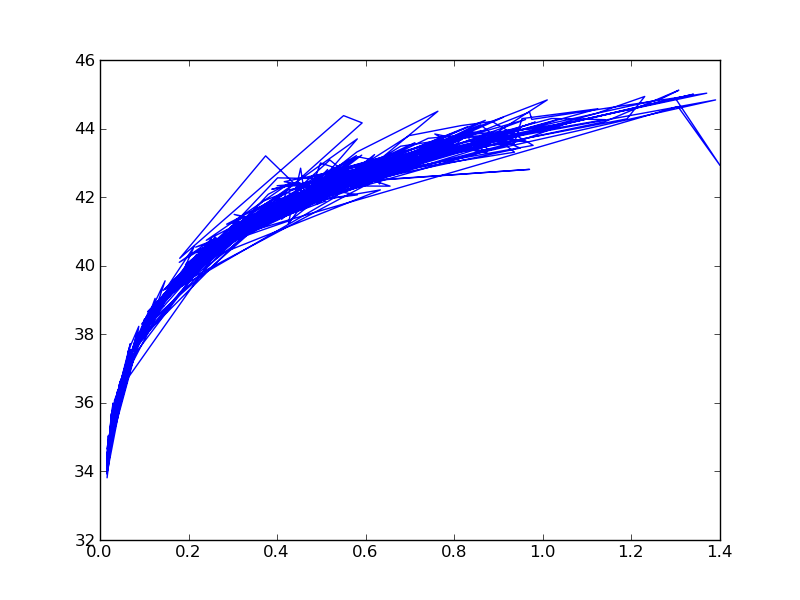
Now let us plot some points:
plt.plot(z_array, mod_array)
Notice it is a mess; by default it connects the lines. We will close it and start over.
plt.close()
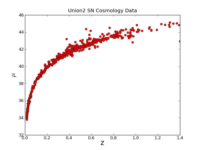
We clearly need a title and axes labels
plt.title("Union2 SN Cosmology Data")
plt.xlabel('z', fontsize=20)
But we want a Greek Letter, so we can put some LaTeX syle code with the r command:
plt.ylabel(r'$\mu$', fontsize=20)
Now we add a format string to the plot command:
plt.plot(z_array, mod_array,'ro')
Now this looks better, we have red circles. The ro string, is what told it to give us red circles. A b would give us blue dots, or ys would give yellow squares.
Plotting with Error Bars
Now let's plot with the error bars
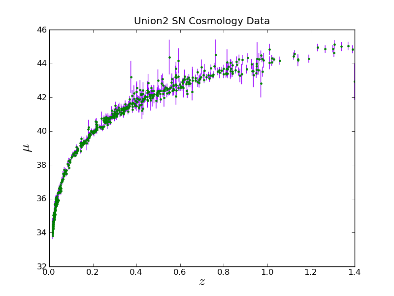
plt.close()
plt.errorbar(z_array, mod_array, yerr=moderr_array, fmt='.', capsize=0,
    elinewidth=1.0, ecolor=(0.6,0.0,1.0), color='green' )
Notice that colors can be specified with a fmt (same syntax as in the above example) or a color keyword. With the color keyword they can be given via an RGB tuple, an RGB hex code, a name, or a single number between '0.0' and '1.0' for gray scale.
And putting labels and colors we can do:
plt.xlabel(r'$z$', fontsize=20)
plt.ylabel(r'$\mu$', fontsize=20)
plt.title("Union2 SN Cosmology Data")
Plotting Histograms
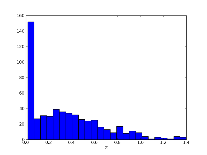
Now there are a lot of points, so let's figure our what our distribution is in z:
plt.close()
plt.hist(z_array, 25)   # 25 is the number of bins
# And slap a label on it
plt.xlabel(r'$z$', fontsize=20)
plt.close()
Plotting With Asymmetrical Error Bars
Now, let's find the "real" distance from the distance modulus. To do this we will define a function and a constant.
def distance_Mpc(m,z):
    return 0.00001 * (10**(m/5)) / (1.0 + z)

c = 299792.458    # km/s
So the distance can be found with:
d_array = distance_Mpc(mod_array,z_array)
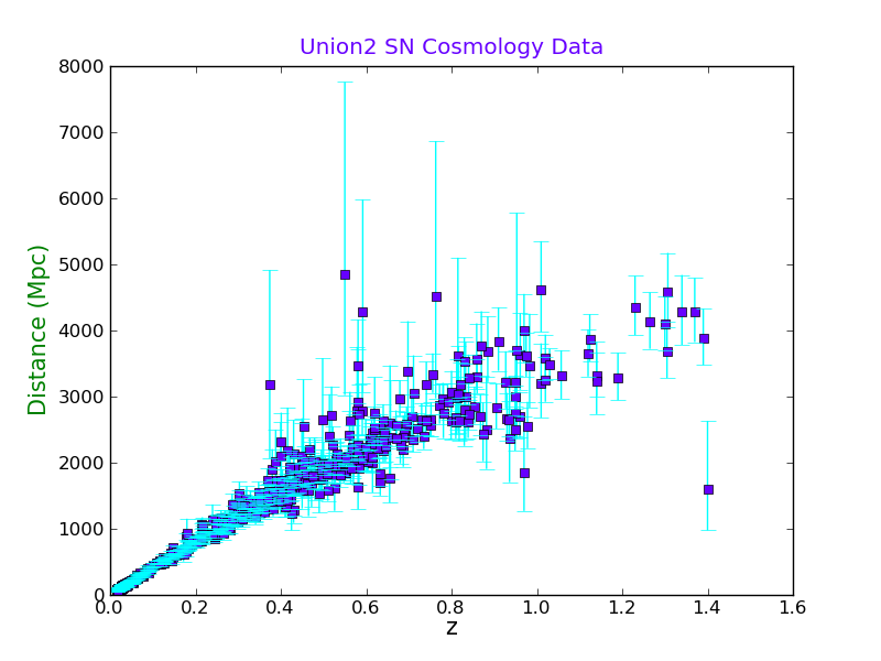
Now we will calculate the error bars in the distance, both ways:
d_error_plus  = ( distance_Mpc((mod_array+moderr_array),z_array) - d_array )
d_error_minus = ( d_array - distance_Mpc((mod_array-moderr_array),z_array) )
And plot the graph with asymmetrical horizontal error bars, and labels. Notice the different color formats that can be used.
plt.close()
plt.errorbar(z_array, d_array, yerr=(d_error_minus,d_error_plus), fmt='s',
    capsize=5, elinewidth=1.0, color=(0.4,0.0,1.0), ecolor='aqua', barsabove=True)
plt.xlabel('z', fontsize=15, color='0.0')
plt.ylabel('Distance (Mpc)', fontsize=15, color='g')
plt.title("Union2 SN Cosmology Data", color=(0.4,0.0,1.0))
Plotting With a Second Axis
Now we will make a plot with both Mpc and Gly on the same plot.
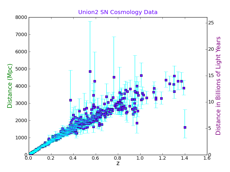
First we read the existing plot limits into an array:
axes1_range = np.array( plt.axis() )
We want to use the same x-axis so we use the function:
plt.twinx()   #  This swaps the Y axis
plt.ylabel('Distance in Billions of Light Years', fontsize=15, color='purple')
Now we will make the second axes the right scale:
axes2_range = axes1_range.copy()  # Don't forget, we need to make a copy of it.
axes2_range[2:4] = 3.26*axes1_range[2:4]/1000.0  # set second y-axis to Gly
plt.axis(axes2_range)
Plotting With Multiple Axes and Annotation
Now imagine we want to make a plot for the public, so we need to find the distance in light years. Also, we want to plot cz.
plt.close()
plt.errorbar(3.26*d_array/1000.0, c*z_array,
    xerr=(3.26*d_error_minus/1000.0, 3.26*d_error_plus/1000.0),
    fmt='.', capsize=0, elinewidth=1.0, color=(0.4,0.0,1.0), ecolor='aqua',
    barsabove=False, zorder=2)
plt.ylabel('cz (km/s)', fontsize=15, color='aqua')  # plot the labels
plt.xlabel('Distance (Billions of Light Years)', fontsize=15, color='aqua')
Now, you want to make the plot also include z and Mpc, so we need to convert our axes:
axes1_range = np.array( plt.axis() ) # get the existing axes and convert to an array
axes2_range = axes1_range.copy()  # Don't forget, we need to make a copy of it.
axes2_range[0:2] = 1000*axes1_range[0:2]/3.26  # set second x-axis to Mpc
axes2_range[2:4] = axes1_range[2:4]/c # set second y-axis to z
Now we switch to the second axis
plt.subplots_adjust(right=0.875, top=0.8)  # make room for each axis
plt.twinx()   #  This swaps the Y axis
plt.ylabel('z', fontsize=15, color='r')  #  I am not sure why this has to be before plt.twiny()
plt.twiny()   #  This swaps the X axis
plt.xlabel('Distance (Mpc)', fontsize=15, color='purple')
plt.title("Union2 SN Cosmology Data", color=(0.4,0.0,1.0), x=0.5, y=1.15)
plt.axis(axes2_range)
And we will put Hubble's law on it just for fun. Using the zorder keyword, we can make sure the line is plotted over the points.
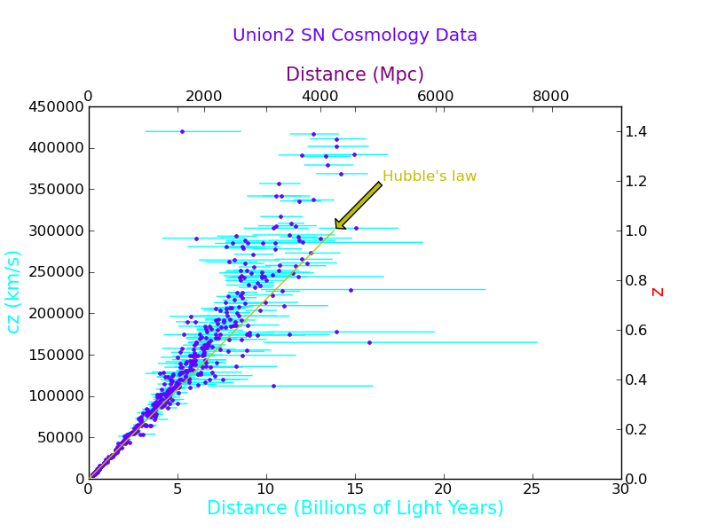
H = 70.8  # km/s/Mpc
z_limits = np.array([0.0,1.0])  #  Plot is relative to the new axes
d_limits = z_limits*c/H
plt.plot(d_limits,z_limits, 'y-', zorder=4)
Notice that the second plot rescaled the axes, which is a problem for this plot, because both x axes and both y axes represent the same physical quantity. So we reissue the axis function:
plt.axis(axes2_range) # this needs to be after the plot command
Now we will put an arrow on the graph and a label.
plt.annotate("Hubble's law", xy=(d_limits[1],z_limits[1]), color='y', zorder=1,
    xytext=(1.2*d_limits[1],1.2*z_limits[1]), arrowprops=dict(facecolor='y', shrink=0.05))
Saving as a PDF
We can save a file as a PDF or most any other common format this way:
plt.savefig('Union2_plot.pdf', format="pdf", transparent=True, bbox_inches='tight')
It is important to note that some file formats are raster graphics and others are scalable vector graphics.
Go back to the PythonOverview page.
Magnetic Needle Example
File:Magnetic Needle Example.py
Here we show another plotting example, where we calculate the magnetic field surrounding a thin magnetic needle.
First we import matplolib and numpy:
import numpy as np
import matplotlib.pyplot as plt
Next we define the grid size, length or needle, and the size of circular masks around the poles.
N = 20      # Size of NxN array.
R = 0.25    # Size of the two circular masks.
l = 1.0     # Length of the rod.
l2 = l/2.0  # Saves on typing l/2.0 all the time.
Now we will define min and max in the cylindrically radial coordinate (s), and the axial coordinate (z).
# Define s and z
s_delt = 1.0/(N/2)
s_max =  1*(1.0 + 0.5*s_delt)
s_min =  -1*(1.0 - 0.5*s_delt)
# Square Axes
z_delt = 1.0/(N/2)
z_min = -1*(1.0 - 0.5*z_delt)
z_max =  1*(1.0 + 0.5*z_delt)
Now we will find the 1-D space. Notice that it would have been slightly easier to use linspace here instead.
s_space_1D = np.arange(s_min,s_max,s_delt)
z_space_1D = np.arange(z_min,z_max,z_delt)
Now we define a 2-D grid of s and z values:
s, z = np.meshgrid(s_space_1D,z_space_1D)
And of course we find the magnetic field:
# Find each term in turn
Bs = 1.0/np.sqrt(s**2 + (z - l2)**2) - 1.0/np.sqrt(s**2 + (z + l2)**2)
Bs = Bs + (z + l2)**2 / (s**2 + (z + l2)**2)**1.5 - (z - l2)**2 / (s**2 + (z - l2)**2)**1.5
Bs = (1.0/(l*s))*Bs
Bz = (z + l2) / (s**2 + (z + l2)**2)**1.5 - (z - l2) / (s**2 + (z - l2)**2)**1.5
Bz = (-1.0/l)*Bz
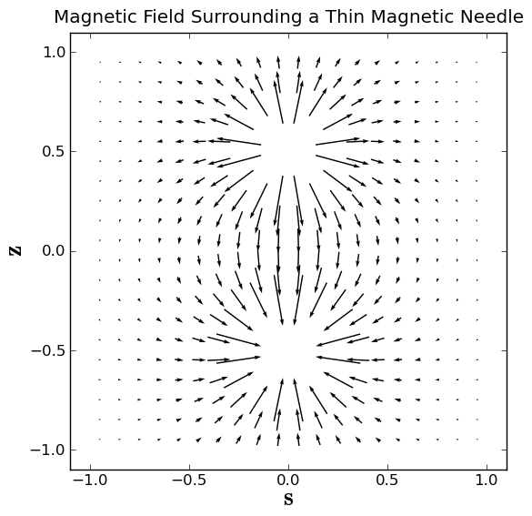
Now we make and apply the mask to cover both poles:
mask = np.logical_or(np.sqrt(s**2 + (z-l2)**2) < R,np.sqrt(s**2 + (z+l2)**2) < R)
Bs = np.ma.masked_array(Bs, mask)
Bz = np.ma.masked_array(Bz, mask)
Now we can make an arrow plot of the magnetic field:
plt.close()
plt.box(on='on')
plt.axis('scaled')
plt.axis((-1.1, 1.1, -1.1, 1.1))
plt.title('Magnetic Field Surrounding a Thin Magnetic Needle')
plt.xlabel(r'$\bf s$', fontsize=20)
plt.ylabel(r'$\bf z$', fontsize=20)
plt.quiver(s,z,Bs,Bz,pivot='middle')
plt.savefig("Magnetic_Field_of_Needle.pdf", format="pdf", transparent=True, bbox_inches='tight')
plt.savefig("Magnetic_Field_of_Needle.png", format="png", transparent=False, bbox_inches='tight')
Go back to the PythonOverview page.
Square Magnet Example
Here we show another plotting example, where we calculate the vector potential surrounding a square 2D magnet. We will also find the magnetic field, and plot a contour plot with a vector plot overlaid.
In this example, the vector potential has only a z component, so we will plot it as a filled contour plot, with the location of the magnet and the magnetic field vectors overlaid.
Calculating the Vector Potential and Magnetic Field
First we need to import the packages:
import numpy as np
import matplotlib.pyplot as plt
Now, we define the magnet dimensions and sizes of arrays
L = 1.0  # Length of Magnet
W = 1.0  # Width of Magnet
Nplt = 16   # Size of output magnetic field quiver plot
skip = 5  # Plot every skip point in each direction
smooth = 4   #Median of points for finding derivatives for added robustness
N = skip*(Nplt + 2) # Make NxN array for the total calculation
n = 30  # Size of nxn array that bounds the magnet
Next we will define the X and Y ranges
# Define Maximum and minimum area of the magnet
X_max = W/2.0
X_min = -1*W/2.0
Y_max = L/2.0
Y_min = -1*L/2.0
# Define the X and Y 1 D arrays
X = np.linspace(X_min,X_max,num=n)
Y = np.linspace(Y_min,Y_max,num=n)
# And corresponing 2D arrays
XX, YY = np.meshgrid(X,Y)
# Define Maximum and minimum area of the calculation
scale =( N + 2*smooth )/(N.__float__() - 1.0)
x_max = 1.0*scale
x_min = -1.0*scale
y_max = 1.0*scale
y_min = -1.0*scale
# Define the x and y 2D arrays for whole area
x, y = np.meshgrid(np.linspace(x_min,x_max,num=N),np.linspace(y_min,y_max,num=N))
# Define dx, dy, dX, dY, dR
dx = x[N/2+1,N/2+1] - x[N/2,N/2]
dy = y[N/2+1,N/2+1] - y[N/2,N/2]
dX = X[n/2+1] - X[n/2]
dY = Y[n/2+1] - Y[n/2]
dR = np.sqrt(dX**2 + dY**2)
Now we define the magnetization array as a constant vector in the y-direction.
My = 1.0 * ( np.logical_and((np.abs(YY) <= L/2.0),(np.abs(XX) <= W/2.0)) )
Mx = 0.0 * My
M = np.sqrt(Mx**2 + My**2)
Now, we find the differential vector potential (dAz) as a function of the location of the magnetic dipole element (X,Y) and the position of interest (x,y).
First we initialize some variables:
dAz = np.zeros((n,n,N,N))   # initialize dA as an n x n x N x N array
rR2  =  np.zeros((N,N))  # initialize N x N matrixe
Az   =  np.zeros((N,N))
pi = 3.14159265359
We need to make sure that we are ignoring distances smaller than the gridsize, so we define a minimum distance:
dR2  = dR**2   #  The X Y diagonal gridsize spacing squared
rR2max = (x_max-x_min+X_max-X_min)**2 + (y_max-y_min+Y_max-Y_min)**2
Now remember a 4-D array is simply a 2D array of 2D arrays, so we iterate over each position on the magnet.
i = 0
while i < n:  # The X Loop
    j = 0
    while j < n:  # The Y Loop
        rR2 = (x-X[i])**2 + (y-Y[j])**2
        rR2 = rR2.clip(2*dR2, 10*rR2max)  #  Clip at two grid spacing, and large distances
        dAz[j,i,:,:] = (0.5/pi) * ( Mx[j,i]*(y-Y[j]) - My[j,i]*(x - X[i]) ) / rR2
        j += 1
    i += 1
# End Looping
Now we numerically integrate over the magnet, to find the vector potential, using the trapezoid method. Remember dAz is a 4D array, but Az is a 2D array.
Az = np.trapz(np.trapz(dAz, Y, axis=0), X, axis=0)
Now that we have the vector potential, we need to take the curl to find the magnetic field. We will take multiple derivatives, for added robustness.
Bx   =  np.zeros((N,N))  # Initiate Bx and By
By   =  np.zeros((N,N))
Dx   =  np.zeros(smooth-2)   # Initiate the Dx and Dy arrays
Dy   =  np.zeros(smooth-2)
i = smooth
while i < N-smooth:  # The x Loop
    j = smooth
    while j < N-smooth:  # The y Loop
        k = 2
        while k < smooth:   #  This loop is to add robustness by calculating multiple derivatives
            Dx[k-2] =    (Az[j,i+k+1] - Az[j,i-k])/(x[j,i+k+1] - x[j,i-k])
            Dy[k-2] =    (Az[j+k+1,i] - Az[j-k,i])/(y[j+k+1,i] - y[j-k,i])
            k += 1
        Bx[j,i] = np.median(Dy)
        By[j,i] = -1*np.median(Dx)
        j += 1
    i += 1
# End Looping
Now we will make smaller arrays to plot the magnetic field.
step = skip
start = (N-skip*Nplt)/2 + 2
stop = (N+skip*(Nplt-1))/2 + 1
BpltX   =  Bx[start:stop:step,start:stop:step]
BpltY   =  By[start:stop:step,start:stop:step]
xplt    =  x[start:stop:step,start:stop:step]
yplt    =  y[start:stop:step,start:stop:step]
Plotting
First we close and open a plot window, and set the axes and lables.
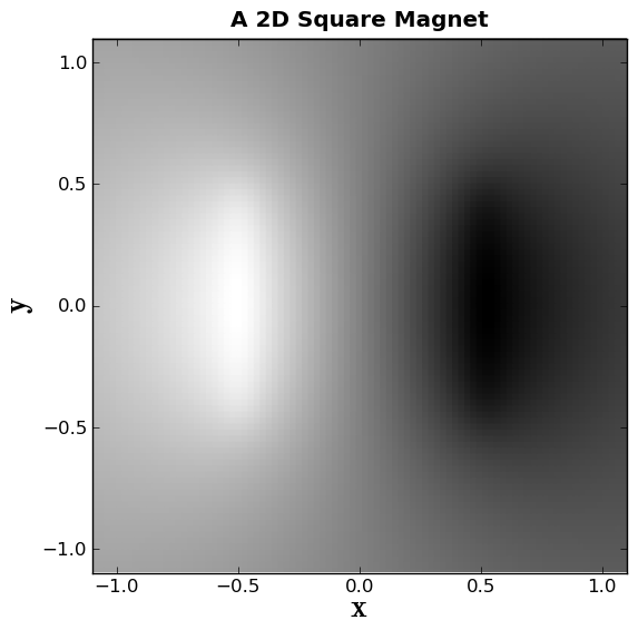
plt.close()
plt.box(on='on')
plt.axis('scaled')
plt.axis((-1.1, 1.1, -1.1, 1.1))
plt.xlabel(r'$\bf x$', fontsize=20)
plt.ylabel(r'$\bf y$', fontsize=20)
TITLE ="A 2D Square Magnet"
plt.title(TITLE, weight='bold')
Now we will make a grayscale plot of the vector potential:
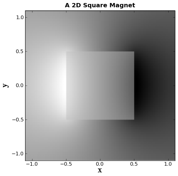
plt.gray()
plt.pcolor(x,y,Az, alpha=1.0, zorder=0)
Alpha represents the opacity, and zorder represents what layer this represents.
Now we will plot a box to represent the magnet.
box1x = (-1*L/2.0,L/2.0,L/2.0,-1*L/2.0)
box1y = (-1*W/2.0,-1*W/2.0,W/2.0,W/2.0)
plt.fill(box1x,box1y, facecolor='silver', edgecolor='None', alpha=0.5 , zorder=2)

Now, we will make a colorful filled contour plot of the vector potential, and plot it underneath the box, but on top of boring gray scale plot we made. We will also include a colorbar.
plt.spectral()
plt.contourf(x,y,Az,20, alpha=1.0, zorder=1)
plt.colorbar(orientation='vertical')
plt.figtext(0.92, 0.35, 'The Vector Potential', rotation=-90, weight='bold')
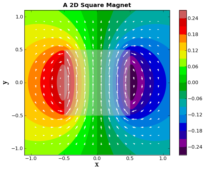
Now, let's plot white magnetic field vectors on top of the vector potential plot. We will also make sure that the longest arrow length is the grid spacing.
scale = np.max(np.sqrt(BpltX**2 + BpltY**2)) * Nplt  # The bigger the scale, the shorter the arrow
plt.quiver(xplt,yplt,BpltX,BpltY,pivot='middle',units='height', scale=scale,
    zorder=4, color='white')
And if you want to save this plot, you can do so:
filename = TITLE.replace(' ','_') + "plot_3" + ".pdf"
plt.savefig(filename, format="pdf", transparent=True, \
    bbox_inches='tight')
print("Saved file as: " + filename)
Go back to the PythonOverview page.